---
title: Visualising Vowel Space Change with GAMMs
author:
- name: "Joshua Wilson Black"
url: "https://joshua.wilsonblack.nz/"
affiliations:
- "New Zealand Institute of Language, Brain and Behaviour, University of Canterbury"
date: '2022-10-28'
license: "CC-BY-SA-4.0"
format:
html: default
pdf: default
editor:
markdown:
wrap: 72
bibliography: references.bib
image: "index_files/figure-html/unnamed-chunk-17-1.gif"
twitter-card:
image: "index_files/figure-html/unnamed-chunk-16-1.png"
open-graph:
image: "index_files/figure-html/unnamed-chunk-16-1.png"
---
## Introduction
Multiple recent projects at
[NZILBB](https://www.canterbury.ac.nz/nzilbb/) have used [Generalised
Mixed Models
(GAMMs)](https://en.wikipedia.org/wiki/Generalized_additive_model) to
investigate changes in vowel spaces both across multiples speakers and
within single speakers.
In such projects, it is useful to visualise changes to vowel spaces over
time with both static plots and animations.
This post sets out a structure for fitting models of the first and
second formants of a series of vowels and for visualising them together
within vowel space diagrams.
This general structure, and some specific code for visualisation, was
originally developed by James Brand for @brand2021.
I'll assume the reader knows something about vowels and vowel spaces,
the basics of data manipulation with `dplyr`, and setting up models in
R.
## Fitting Multiple Models with `purrr` and `mgcv`
### Setup
We're going to fit these models with a small subset of the data from the
[Origins of New Zealand English
(ONZE)](https://www.canterbury.ac.nz/nzilbb/research/onze/) corpus. This
dataset contains first and second formant data for 100 speakers of New
Zealand English (for details see [supplementaries for Brand et al.
2021](https://osf.io/q4j29/)). The data can be found
[here](anon_ONZE_mean_sample.rds){target="_blank"}.
For the purposes of this post any similar data set would be fine. We
need:
- first and second formant data,
- a range of vowels (we'll only look at monophthongs here),
- a time variables (whether year of birth, age category, or time
through recording), and
- any variables you wish to control for.
Let's [load the libraries](renv.lock){target="_blank"} we will use and
have a look at the data.
``` r
# Load renv environment
renv::use(lockfile = "renv.lock")
```
```{r}
#| message: false
# Load tidyverse and friends.
library(tidyverse)
library(gganimate)

# mgcv will be used for fitting gamms later and itsadug for visualisation
library(mgcv)
library(itsadug)

# kable for displaying the dataset.
library(kableExtra)

vowels <- read_rds('anon_ONZE_mean_sample.rds')

vowels %>%
  head(10) %>%
  kable() %>%
  kable_styling(font_size = 11) %>%
  scroll_box(width = "100%")
```
In this dataset each row is a vowel token, with columns:
- `F1_50` and `F2_50`: F1 and F2, taken at the midpoint measured in
Hz,
- `Vowel`: Wells lexical set labels for New Zealand English
monophthongs,
- `yob`: participant year of birth (our time variable),
- `Speech_rate`: the average speech rate of the participant across the
recording (a control variable),
- `Speaker`: a code indicating which speaker the token comes from
(sometimes useful as a random effect), and
- `Gender`: the gender of the speaker (in this case, an `M`/`F`
binary).
In any real research project, you will need to engage in a lot of data
exploration here. Do you have good data coverage? Is there evidence of
outliers in the data? Does the data need to be normalised? This is the
time to ask this kind of question. The answers will, of course, depend
on your research questions. For this post, the only point of this data
is to illustrate a method for modelling and visualising. We can skip
these questions!
We will now fit separate models for the F1 and F2 of each vowel. Rather
than using a big `for` loop, or fitting each model with a separate line
of code, we will use the `purrr` method of *nesting* our data so that we
have a row for each of the models we want to fit, fit the models, and
then *unnest* to produce data which can be used to visualise our model.
**We nest, we mutate, and we unnest.** This is a common pattern with
`purrr`.
Before we nest, we need to slightly modify our data. Rather than having
a column for our F1 data and a column for our F2 data, we want to
capture there in *rows*. That is, we need our table to be *longer*.
There will then be two rows for each token, one for the F1 and one for
the F2.
To do this, we use the trusty `dplyr` function `pivot_longer()`:
```{r}
vowels <- vowels %>%
  pivot_longer(
    cols = F1_50:F2_50, # Select the columns to turn into rows.
    names_to = "Formant", # Name the column to indicate if data is F1 or F2,
    values_to = "Frequency"
  )

vowels %>%
  head(10) %>%
  kable() %>%
  kable_styling(font_size = 11) %>%
  scroll_box(width = "100%")
```
As the table above shows, we now have a column indicating whether a
frequency value is an F1 or an F2 reading.
### Nest
We now nest the data. We do this by grouping the data by the columns
which identify the models we want to fit. In this case, we fit an F1 and
an F2 model for each vowel. So the columns we need to identify our
models are `Vowel` and `Formant`. Once we've grouped, we simply use the
function `nest()`.
```{r}
vowels <- vowels %>%
  group_by(Vowel, Formant) %>%
  nest()

vowels
```
The output above shows that we now have a three column data frame (or,
in tidyverse speak, a tibble), with the familiar columns `Vowel` and
`Formant` and a new column `data`. The column `data` contains tibbles
which live *inside* our tibble. That is, *nested* tibbles. These contain
the data which we will use to model each vowel and formant separately.
### Mutate (and Map)
We can perform actions on the tibbles in the `data` column by using
`mutate` (just as we would modify other data in a tibble). In this case
we will create a column to store our models. The basic structure will
look something like this.
```{r}
#| eval: false
vowels <- vowels %>%
  mutate(
    model = #???
  )
```
The question marks can be filled in with the `map()` function. This
enables us to apply a function to fit a model to each of our nested
tibbles.
So, what will this function look like? This is not the place for a
tutorial on GAMs (for which, go
[here](https://arxiv.org/abs/1703.05339)). We will fit a model which
predicts formant frequency from the gender of each participant, their
year of birth, and their average speech rate. One way to implement this
structure in `mgcv` is with the formula
`Frequency ~ Gender + s(yob, by=Gender) + s(Speech_rate)`.
This structure will be the same for *all* of our nested tibbles. The
only thing that will change is the data fed in to it. In this kind of
case, we can use `~` to turn our model expression into a function and
`.x` as a pronoun for the nested tibbles. Let's see what this look like
and then explain further:
```{r}
vowels <- vowels %>%
  mutate(
    model = map(
      data, # We are applying a function to the entries of the `data` column.
      # This is the function we are applying (introduced with a ~)
      ~ bam(
          # Here's our formula.
          Frequency ~ Gender +
            s(yob, by=Gender, k=5) +
            s(Speech_rate, k=5),
          data = .x, # Here's our pronoun.
          # Then some arguments to speed up the model fit.
          method = 'fREML',
          discrete = TRUE,
          nthreads = 2
      )
    )
  )
```
The function `bam` is one of the main functions for fitting GAMM models
in `mgcv`. It is often used for large data sets. Our use of `~` creates
a function which is applied to each of our nested tibbles. The entries
in `model` are created by taking the corresponding tibble in the `data`
column and applying the function to it. The tibble is referred to by the
pronoun `.x` in the function. In the above, `.x` is used as the data fed
to `bam()`. So, for the row of our tibble with `DRESS` and `F1_50` in
the `Vowel` and `Formant` columns, the entry for `model` will be a model
produced from the data for [dress]{.smallcaps} and F1.
Note that you can use any modelling function you like here. The general
strategy of nesting and fitting models doesn't have any special
connections with GAMs or `mgcv`. You could fit a linear model with `lm`
or a generalised linear model using the `lme4` package.
We now have GAMM models for each of these vowels. These are stored in
the `model` column we have just created. We can check out one of these
models using the `itsadug` `plot_smooth()` function as follows:
```{r}
#| label: fig-smooth-plot
#| fig-cap: "Smooth plot for KIT F1"
#| message: false
plot_smooth(
  vowels$model[[7]], # Pick the first entry in the model column.
  view = "yob", # The x-axis variable.
  plot_all = "Gender",
  main= paste(vowels$Vowel[[7]], vowels$Formant[[7]])
)
```
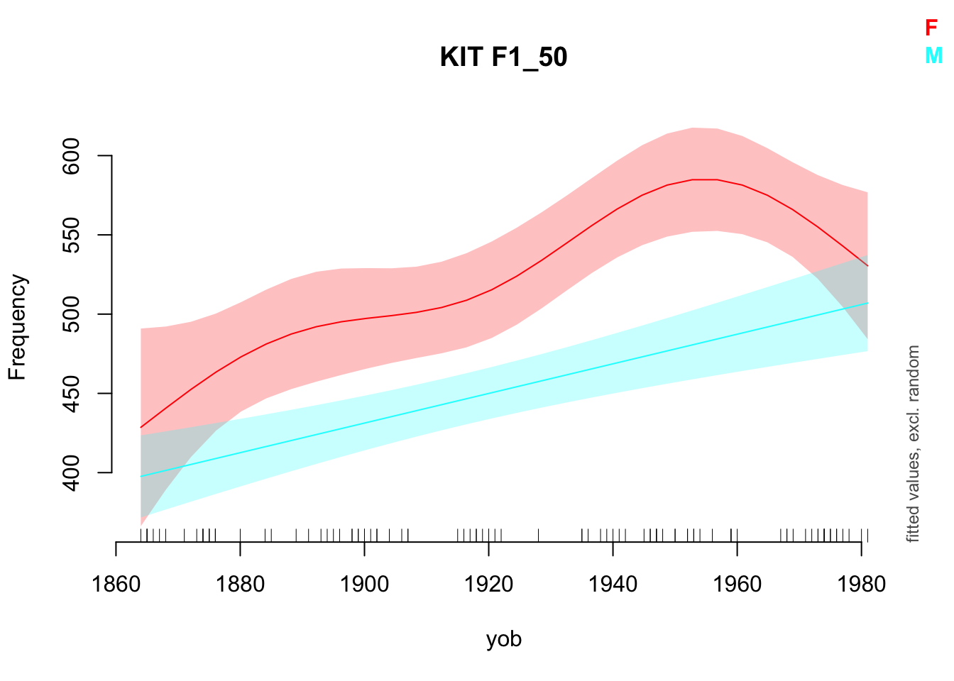
@fig-smooth-plot shows a well known feature of the development of New
Zealand English: the centralisation of the [kit]{.smallcaps} vowel. It
also indicates something to keep in mind when fitting non-linear models.
The wiggles in the smooth for the female speakers might simply be over
fitting our particular sample. Again, this is illustrative of a general
pattern, each step of which requires criticism in practice!
For the purpose of visualisation, we want predictions from our model to
plot. To do this, we map again. This time, we use the `itsadug` function
`get_predictions()` instead of the `mgcv` function `bam()`, but the
underlying idea is the same. The function `get_predictions()` needs us
to tell it what values we want predictions for. In this case, we want
predictions for the full range of years of birth in our data set
(1864-1981) *and* for both genders.
The following code stores the values we want predictions for in the
`to_predict` object and then creates a `prediction` column using
`mutate()` and `map()`:
```{r}
to_predict <- list(
  "yob" = seq(from=1864, to=1981, by=1), # All years
  "Gender" = c("M", "F")
)
# BTW: Get prediction will just assume the average value for any predictors not
# mentioned (in this case, Speech_rate).

vowels <- vowels %>%
  mutate(
    prediction = map(
      model, # This time we're applying the function to all the models.
      # We again introduce the function with '~', and indicate where the model
      # goes with '.x'.
      ~ get_predictions(model = .x, cond = to_predict, print.summary = FALSE)
    )
  )
```
So what does a tibble of predictions look like?
```{r}
vowels$prediction[[1]] %>%
  head() %>%
  kable() %>%
  kable_styling() %>%
  scroll_box(width = "100%")
```
As expected, we get a predicted value for each gender in each of the
years spanned by the data.
### Unnest
In order to visualise the predictions of our models, we need to *unnest*
this data set. We will do this in a slightly non-standard way, by making
a new unnested tibble at this stage rather than modifying our original
tibble again. But the same principles apply.
In this case, we need to select our identifying variables (`Vowel` and
`Formant`) and the column with the data we want access to in a
non-nested form (for us, `prediction`). We unnest as follows:
```{r}
predictions <- vowels %>%
  select(
    Vowel, Formant, prediction
  ) %>%
  unnest(prediction)

predictions %>%
  head() %>%
  kable() %>%
  kable_styling() %>%
  scroll_box(width = "100%")
```
Our tibble now has our predicted values along with the `Vowel` and
`Formant` information which identifies which model they came from.
Note that we have now thrown away our individual speaker information.
This is often the case when visualising models of this sort as we are
not interested in predicting the speech of this or that particular
speaker in our data set. Rather, we want to say something about NZE
speech *in general*.
We are now in a position to *visualise* changes in the overall NZE vowel
space.
## Visualise Model Predictions as a Vowel Space
We first produce a static plot using a standard `ggplot` approach and
then produce an animation using `gganimate`.
We begin by defining a colour scheme (following @brand2021, again).
These use html colour codes (plenty of explanations are available
online).
```{r}
vowel_colours <- c(
  DRESS = "#9590FF",
  FLEECE = "#D89000",
  GOOSE = "#A3A500",
  KIT = "#39B600",
  LOT = "#00BF7D",
  NURSE = "#00BFC4",
  START = "#00B0F6",
  STRUT = "#F8766D",
  THOUGHT = "#E76BF3",
  TRAP = "#FF62BC"
)
```
We also need to reverse our previous use of `pivot_longer()`. Why? Well
vowel spaces have F1 as the *y*-axis and F2 as the *x*-axis. This
requires F1 and F2 to be distinct columns. To do this, we use
`pivot_wider()`. This is made easier if we remove the columns we will
not use for plotting first.
```{r}
predictions <- predictions %>%
  select( # Remove unneeded variables
    -Speech_rate,
    -CI
  ) %>%
  pivot_wider( # Pivot
    names_from = Formant,
    values_from = fit
  )

predictions %>%
  head() %>%
  kable() %>%
  kable_styling() %>%
  scroll_box(width = "100%")
```
### Static Plot
The plot we eventually produce is quite complex. Let's start with
depicting the data in two-dimensions using points and only plotting the
female speakers.
```{r}
predictions %>%
  # Filter so only female speakers are plotted.
  filter(
    Gender == "F"
  ) %>%
  ggplot(
    aes(
      x = F2_50,
      y = F1_50,
      colour = Vowel
    )
  ) +
  # Add the points
  geom_point() +
  # Change the colours for the vowels to match those defined above.
  scale_colour_manual(values = vowel_colours)
```
This is the wrong way around for a vowel plot. So we reverse the *x* and
*y* axes.
```{r}
predictions %>%
  filter(
    Gender == "F"
  ) %>%
  ggplot(
    aes(
      x = F2_50,
      y = F1_50,
      colour = Vowel
    )
  ) +
  geom_point() +
  scale_x_reverse() +
  scale_y_reverse() +
  scale_colour_manual(values = vowel_colours)
```
It's also unclear which direction these changes are occurring. We need
to swap out `geom_point()` for something directed. In this case, we use
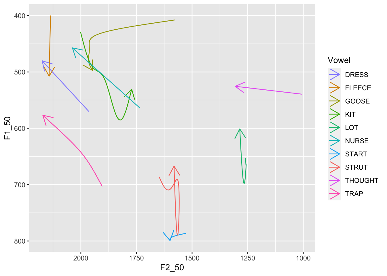
`geom_path()` and `arrow()`.
```{r}
predictions %>%
  filter(
    Gender == "F"
  ) %>%
  ggplot(
    aes(
      x = F2_50,
      y = F1_50,
      colour = Vowel
    )
  ) +
  geom_path(arrow = arrow(length = unit(5, "mm"))) +
  scale_x_reverse() +
  scale_y_reverse() +
  scale_colour_manual(values = vowel_colours)
```
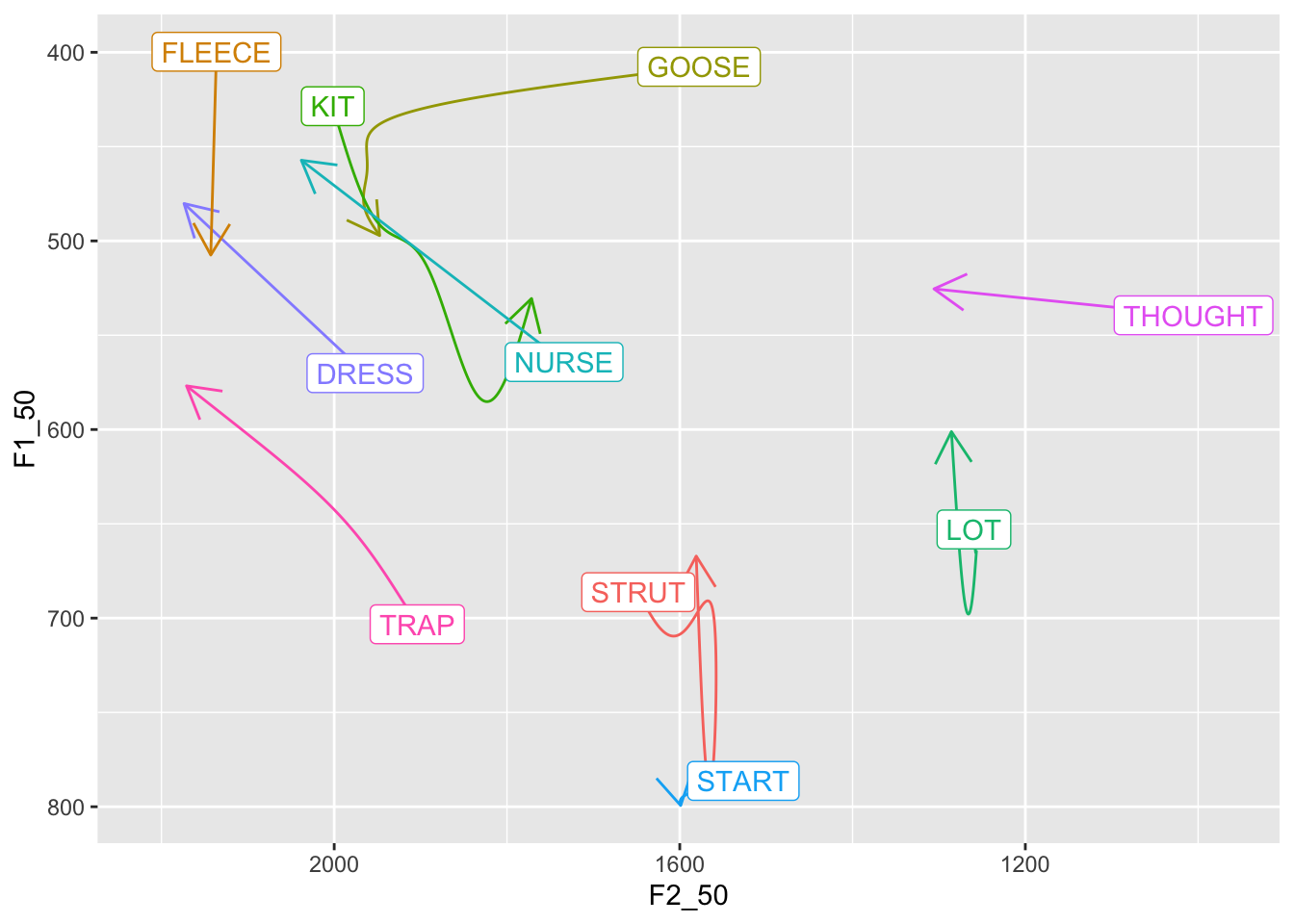
We can add labels to the start of each arrow and remove the legend. This
is found by some to be a more clear vowel plot. To do this, we have to
pick out the first observation of each vowel in a new tibble. This
prevents us from labelling *every* point on the line.
```{r}
first_obs <- predictions %>%
  group_by(Vowel, Gender) %>%
  slice(which.min(yob))

predictions %>%
  filter(
    Gender == "F"
  ) %>%
  ggplot(
    aes(
      x = F2_50,
      y = F1_50,
      colour = Vowel,
      label = Vowel # Add label to the aesthetics.
    )
  ) +
  geom_path(
    arrow = arrow(length = unit(5, "mm")),
    show.legend = FALSE # Remove legend
  ) +
  geom_label(
    # Note filtering as we are only dealing with female speakers now.
    data = first_obs %>% filter(Gender == "F"),
    show.legend = FALSE # Again remove legend.
  ) +
  # Often need to use 'expansion' here to fit in 'THOUGHT'
  scale_x_reverse(expand = expansion(add = 100)) +
  scale_y_reverse() +
  scale_colour_manual(values = vowel_colours)
```
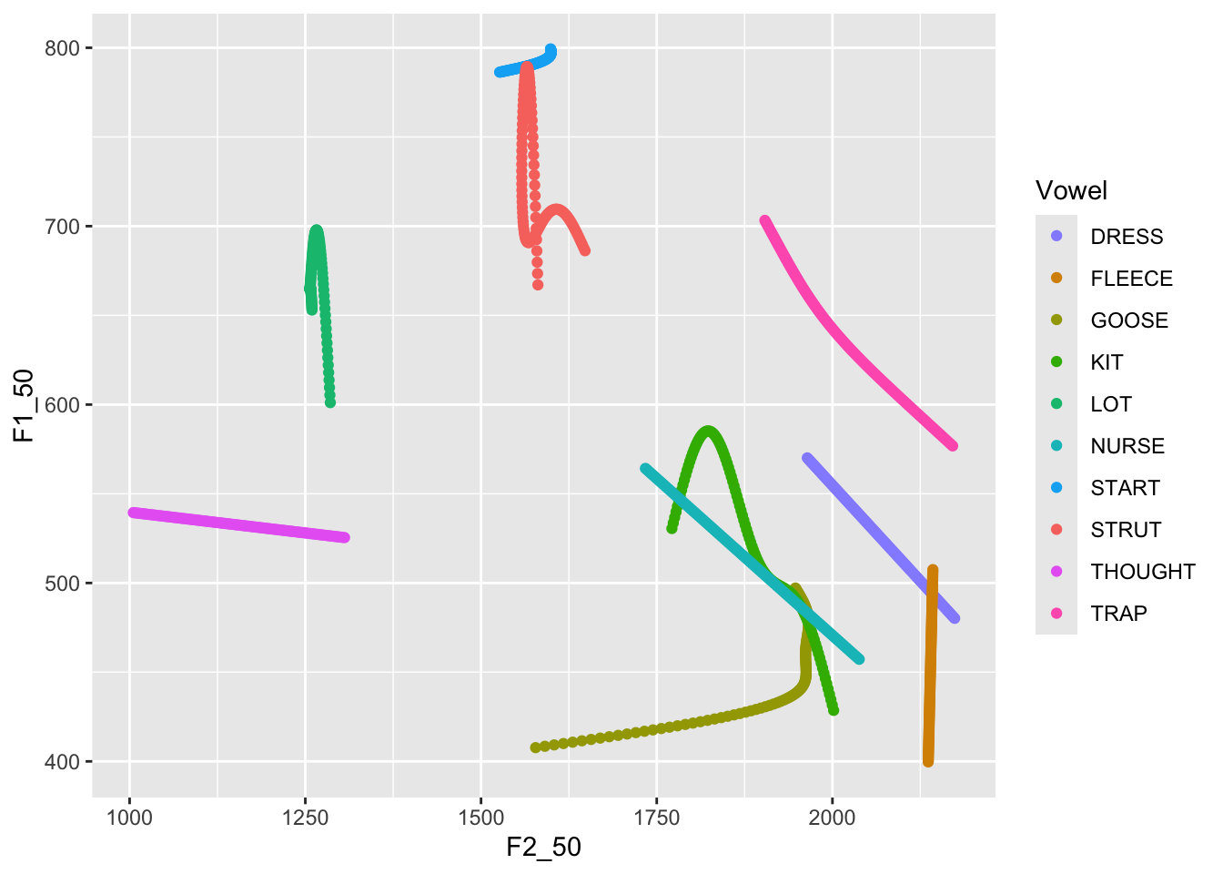
We can use the faceting functions to plot both male and female data. We
use the `facet_grid()` function. **NB**: this requires us to remove the
`filter()` functions from the above.
```{r}
predictions %>%
  ggplot(
    aes(
      x = F2_50,
      y = F1_50,
      colour = Vowel,
      label = Vowel
    )
  ) +
  geom_path(
    arrow = arrow(length = unit(5, "mm")),
    show.legend = FALSE
  ) +
  geom_label(
    data = first_obs,
    show.legend = FALSE
  ) +
  scale_x_reverse(expand = expansion(add = 250)) +
  scale_y_reverse() +
  scale_colour_manual(values = vowel_colours) +
  facet_grid(
    cols = vars(Gender)
  )
```
There are still a few shortcomings here. We have overlap of the labels,
which are now a little large. We attempt to fix this, while also adding
a call to `labs()` to properly label the plot.
```{r}
predictions %>%
  ggplot(
    aes(
      x = F2_50,
      y = F1_50,
      colour = Vowel,
      label = Vowel
    )
  ) +
  geom_path(
    arrow = arrow(length = unit(2.5, "mm")), # Make arrows smaller
    show.legend = FALSE
  ) +
  geom_label(
    data = first_obs,
    show.legend = FALSE,
    size = 2.5, # Make labels smaller...
    alpha = 0.7 # ...and slightly transparent.
  ) +
  scale_x_reverse(expand = expansion(add = 200)) + # less expanasion needed.
  scale_y_reverse() +
  scale_colour_manual(values = vowel_colours) +
  facet_grid(
    cols = vars(Gender)
  ) +
  labs(
    title = "Vowel Space Change in NZE (yob: 1864-1981)",
    x = "First Formant (Hz)",
    y = "Second Formant (Hz)"
  )
```
This figure is a good starting point for the kind of smaller adjustments
needed to produce a good vowel space visualisation. In your own cases, a
lot will depend on the specifics of the models and how much change is
being depicted. In this case, it would be nice to make some of these
lines a little less messy. Some of the problems here, for instance, the
messy lines for [start]{.smallcaps} and [strut]{.smallcaps} in the male
speakers, suggest that our models might be behaving a strangely. This is
not a problem for this illustration, but some model criticism would be
required in a real research project!
### Animation
One problem with the static plot is that we can't see variation in the
rate of change (if any exists). Nor can we figure out, for any point on
the line (apart from the start and end) which year it represents. This
can be fixed with the
[`gganimate`](https://gganimate.com/articles/gganimate.html) package.
We use the `gganimate` function `transition_reveal()` at the end of our
plot with `yob` as the variable we animate with. Our `geom_label()`, the
text with the vowel name, will be the main item we animate. The labels
will move around the vowel space over time. We change our `geom_path()`
so that it has no arrows and simply traces where the label of the vowel
moves.
We add a caption to our `labs()` in which we reference the `gganimate`
variable `frames_along`. This allows us to show what year it is.
Finally, a call to `theme()` lets us make this caption larger.
```{r}
#| message: false
predictions %>%
  ggplot(
    aes(
      x = F2_50,
      y = F1_50,
      colour = Vowel,
      label = Vowel
    )
  ) +
  geom_path(show.legend = FALSE) +
  # NB: our labels just use the predictions dataframe now, so no need for the
  # 'data = ' line.
  geom_label(
    show.legend = FALSE,
    size = 2.5,
    alpha = 0.7
  ) +
  scale_x_reverse(expand = expansion(add = 200)) +
  scale_y_reverse() +
  scale_colour_manual(values = vowel_colours) +
  facet_grid(
    cols = vars(Gender)
  ) +
  labs(
    title = "Vowel Space Change in NZE (yob: 1864-1981)",
    x = "First Formant (Hz)",
    y = "Second Formant (Hz)",
    caption = 'Year of Birth: {round(frame_along, 0)}'
  ) +
  theme(
    plot.caption = element_text(size = 14, hjust = 0)
  ) +
  transition_reveal(along = yob)
```
So there is it: a general structure for fitting models to visualise
changes in vowel formants over time, and for plotting them within vowel
space diagrams.
As I've noted multiple times above, the details will matter at every
step in a real research project. Data quality assessment before
modelling, sensible model structures, evaluation of model quality, and
careful consideration of exactly what needs to be visualised are all
necessary.