
library(tidyverse)

# remotes::install_github("joeystanley/joeysvowels")
library(joeysvowels)Vowel Plots with ggplot2
This is a tutorial on how to make vowel plots in R using the ggplot2 package. Being able to make a vowel plot is a useful skill in contemporary phonetic research, and ggplot2 is an excellent tool to get that done. In this tutorial, I’ll focus on how to make plots in the F1-F2 space (i.e. they roughly resemble the vowel trapezoid you see on the IPA chart).
Note
Note that tutorial is an update to the one I published in 2018 on my personal website. It is largely the same content, with just some touch-ups to wording and code.
For this workshop, we’ll use the tidyverse package, which contains dplyr and ggplot2. The former will be used to manage and manipulate our data. The latter is for plotting. We’ll use one other package, one of my own called joeysvowels, which is just a simple package containing some handy datasets specifically designed for tutorials like this. The package can be installed directly from Github using the install_packages function in the remotes package.
Of course you’re welcome to use your own data.
Read in and process data
As with any R script, the first step (after loading your packages) is to read in and prepare your data. The data we’ll use for this tutorial is called midpoints. Basically, I generated a bunch of words (real and fake) where there was a coronal consonant on either side of vowel. I did that for all the vowels I have in my variety of English, though only 10 are contained in this dataset: all except canonical diphthongs and /ʌ/. I sat at my desk and read all these words and then extracted formant measurements from the vowels. Let’s load it and take a peek at what the data looks like.
midpoints <- joeysvowels::midpoints
midpoints
# A tibble: 566 × 12
vowel_id start end t F1 F2 F3 F4 word pre vowel fol
<dbl> <dbl> <dbl> <dbl> <dbl> <dbl> <dbl> <dbl> <chr> <chr> <fct> <chr>
1 1 2.06 2.41 2.23 368. 1018. 2602. 3168. snoʊz sn GOAT z
2 2 3 3.36 3.18 377. 2032. 2761. 3408. deɪz d FACE z
3 4 4.94 5.19 5.07 314. 2179. 2915. 3380. teɪd t FACE d
4 5 5.91 6.17 6.04 274. 1378. 2235. 3270. zudz z GOOSE dz
5 7 8.13 8.4 8.26 350. 1624. 2485. 3384. stʊz st FOOT z
6 8 9.16 9.41 9.28 313. 2181. 2863. 3205. heɪdz h FACE dz
7 9 10.5 10.8 10.6 255. 1333. 2313. 3212. zuz z GOOSE z
8 10 11.6 11.9 11.8 585 969. 2813. 3405 zɔd z THOUGHT d
9 11 12.6 13.1 12.8 527. 1201. 2733. 3434. sɔz s THOUGHT z
10 14 16.8 17.1 17.0 367. 1594. 2477 3367 sʊz s FOOT z
# ℹ 556 more rowsAs you can see we have the following columns
-
vowel_id: a unique identifier for every vowel token -
start: the time (in seconds) from the beginning of the recording to vowel’s onset. -
end: the time (in seconds) from the beginning of the recording to the vowel’s offset. -
F1,F2,F3,F4: the first four formant frequencies. -
word: an IPA transcription of the word -
pre: the onset of the syllable -
vowel: the vowel. Here I use Wells’ Lexical sets, which is typical in English dialectology. -
fol: the code of the syllable
With that in mind, we’re ready to start making some vowel plots!
Building a basic scatterplot
The way things work in ggplot2 is we be build a visualization layer by layer. The base layer can be created by just using the ggplot function.
ggplot()
It’s just a blank, gray rectangle, but it is valid code. To make this actually useful, we can tell it to work with the midpoints data.
ggplot(midpoints)
Okay still no visualization, but we’re on our way. The next part of a ggplot function is what’s called the mapping argument. This is where you tell ggplot which columns of your data should correspond to what parts of the visualization. Traditionally in vowel plots, we want F2 along the x-axis and F1 along the y-axis. We can do that using the aes function and specify that we want to work with the columns called F1 and F2 from our spreadsheet.

We’re getting closer. What ggplot has done at this point is added some information to your plot already. There are now x- and y-axis labels, ticks, and a grid with major and minor lines. All we need to do is populate this with some data. We can do that by adding a separate layer to the ggplot function. To do this, just add a plus sign (+) at the end of the line, start a new line, and add the function geom_point, which is the function for making a scatterplot in ggplot2.
ggplot(midpoints, aes(x = F2, y = F1)) +
    geom_point()
Aha! We now have a scatterplot! It’s not the most useful one because we can’t tell what vowel or word each point came from. But it is a start.
Themes
Right now, you might be wondering why we have a gray background. This was a conscious choice made by the designers of ggplot2 because it arguably makes colors easier to see. You can change the overall look and feel of your plot using various theme functions. I like theme_bw, theme_minimal, and theme_classic myself; today I’ll stick with theme_minimal.
ggplot(midpoints, aes(x = F2, y = F1)) +
    geom_point() +
    theme_minimal()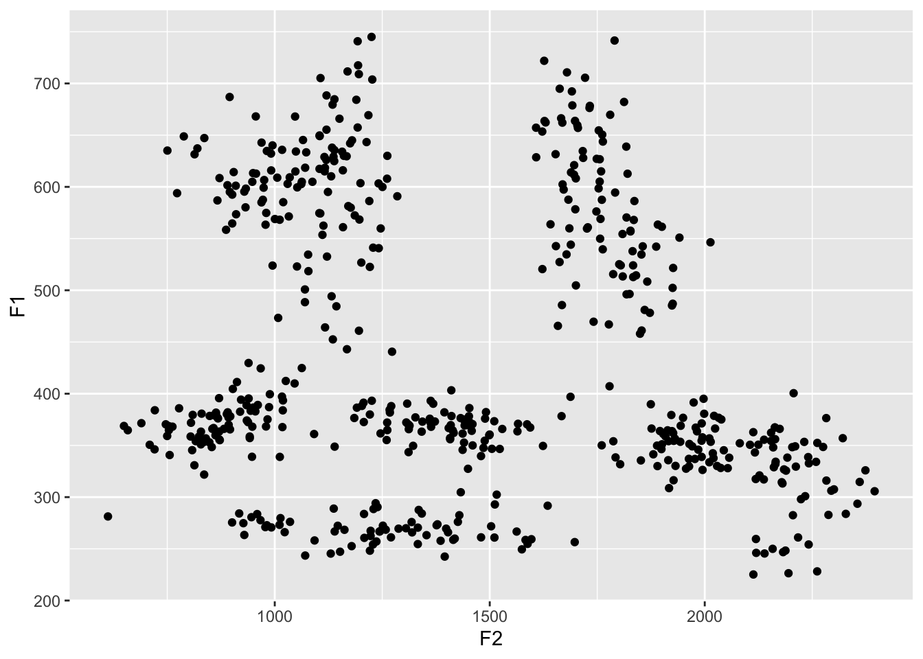
Coloring vowels
Because English has so many vowels, there’s no really good way to show them all on a plot. Typically, I use color, but it’s hard to get a set of 10 colors that are all easily distinguishable and easy on the eyes. There’s no real way to win here. For now, let’s just add the default colors and see how it looks.
So how do we add color? If you think about it, what we want ggplot to do is to change the color of the dot depending on what the vowel is. Since the vowel is stored in a column called vowel in our spreadsheet, in a practical sense we want to tell ggplot to simply change the color of the dot so that each value in the vowel column has its own color. In other words, we want to map the vowel column in our spreadsheet to the color property in the plot.
ggplot(midpoints, aes(x = F2, y = F1, color = vowel)) +
    geom_point() +
    theme_minimal()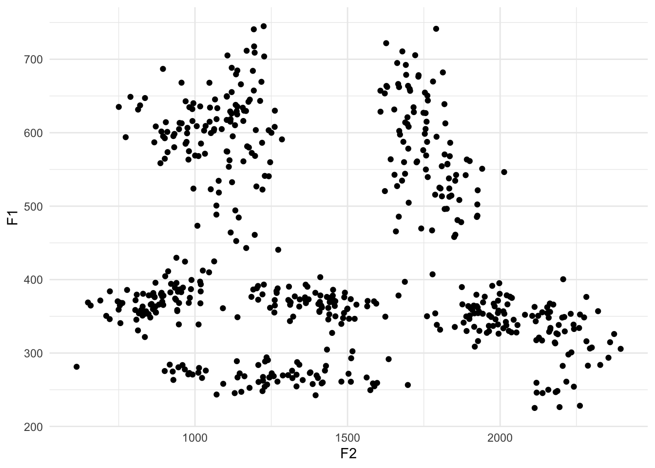
Okay, so let’s look at the result. The most obvious thing we see is that there is now color, but there’s also a legend too. Each unique vowel in our data is now represented in this legend, and the name of the column in our spreadsheet, vowel, is the title of that legend. One subtler change is that the plotting area is actually a little bit narrower to make room for the legend.
How is this color assigned? In your dataset, the vowels will probably appear alphabetical in the legend. So, with that order, ggplot goes around the color wheel from red to pink, and picks equidistant, maximally-distinct colors as you have vowels. In this case, because the midpoints comes prepared with a predetermined order of the vowels, ggplot2 is going to respect that order. So, it puts the vowels in order in the legend, and then again assigns them colors based on 10 equidistant values along a rainbow wheel. Because of the nature of how color works, there are several shades of blue and green, but not very many warm colors. We’ll see how to fix the order of these colors, in just a sec.
Tangent: reversing the axes
Now wait a second. The high front vowel /i/—represented by the label “FLEECE”—is in the bottom right of the plot when it traditionally is in the top left. As it turns out, vowel plots typically reverse both the x- and the y-axes so that high vowels are at the top, and front vowels are on the right. This is just convention but it has to do with the inverse relationship with the actual formant values and our perception of sounds. Anyway, the functions you’re looking for are scale_x_reverse and scale_y_reverse, which should each be added as their own layer.
ggplot(midpoints, aes(x = F2, y = F1, color = vowel)) +
    geom_point() +
    scale_x_reverse() +
    scale_y_reverse() +
    theme_minimal()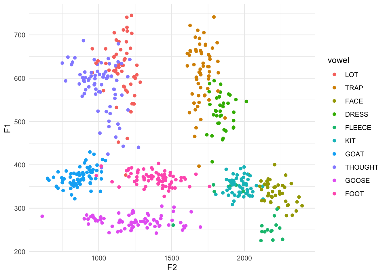
Okay, much better. Now we can see that the teal FLEECE vowel is in the top left, the pink purple-ish GOOSE is in the top right-ish, and my unmerged LOT and THOUGHT (/ɑ/ and /ɔ/, as in cot and caught) are in the bottom right.
Changing the order
If you want to change the order of the colors and the order in the legend, there are two ways to do that. The first is by leaving your underlying data alone and making superficial changes only within ggplot itself. This is a useful thing to know how to do, but I won’t cover that here. If you’re interested, I’d highly recommend this page on that.
At least for the order of the vowels, what I think is the most useful option is to actually modify your dataset and then plot the modified version. The way to do this to overwrite the vowel column in our midpoints dataset, and, using the factor function, manually specifying the order you want them to be in. The actual data itself doesn’t change, but what we’re doing is modifying how R treats this column under the hood. This is the order that I typically do, but you’re of course free to do whatever you want.
midpoints$vowel <- factor(midpoints$vowel, levels = c("FLEECE", "KIT", "FACE", "DRESS", "TRAP",
                                                      "LOT", "THOUGHT", "GOAT", "FOOT", "GOOSE"))
ggplot(midpoints, aes(x = F2, y = F1, color = vowel)) +
    geom_point() +
    scale_x_reverse() +
    scale_y_reverse() +
    theme_minimal()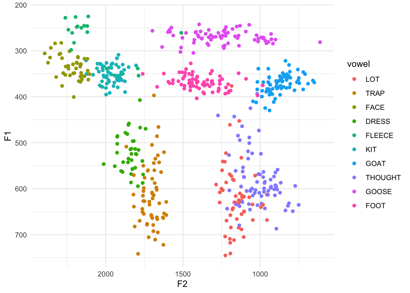
Ah. Now that the order of the vowels goes around the vowel space counterclockwise, we can more easily see the rainbow colors. The benefit to this order is that now the vowels are in a somewhat logical order in the legend. The downside is that the colors of each vowel are very close to other vowels near them in the vowel space (for example, look at DRESS and TRAP or LOT and THOUGHT). What would be better is to have vowels near each other to be different visually. This time, I’ll put the vowels in a more random order.
midpoints$vowel <- factor(midpoints$vowel, levels = c("FLEECE", "DRESS", "THOUGHT", "FOOT", "KIT",
                                                      "TRAP", "GOOSE", "FACE", "LOT", "GOAT"))
ggplot(midpoints, aes(x = F2, y = F1, color = vowel)) +
    geom_point() +
    scale_x_reverse() +
    scale_y_reverse() +
    theme_minimal()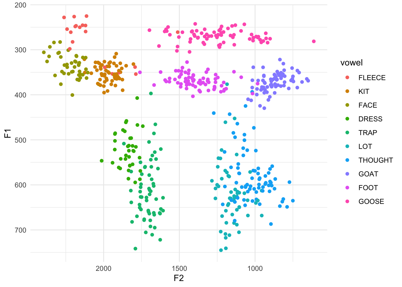
With this particular order, vowels that are close to each other don’t have similar colors. The good part is that the vowels are for the most part relatively easy to distinguish from their neighbors. The major downside is that the legend is the exact order I specified, which is useless for finding something. What we need to do is actually modify the legend order. We can do that with the scale_color_discrete function added to our growing stack of ggplot code and then supply the order you want it to be in as the breaks argument.
ggplot(midpoints, aes(x = F2, y = F1, color = vowel)) +
    geom_point() +
    scale_x_reverse() + scale_y_reverse() +
    scale_color_discrete(breaks = c("FLEECE", "KIT", "FACE", "DRESS", "TRAP",
                                     "LOT", "THOUGHT", "GOAT", "FOOT", "GOOSE")) +
    theme_minimal()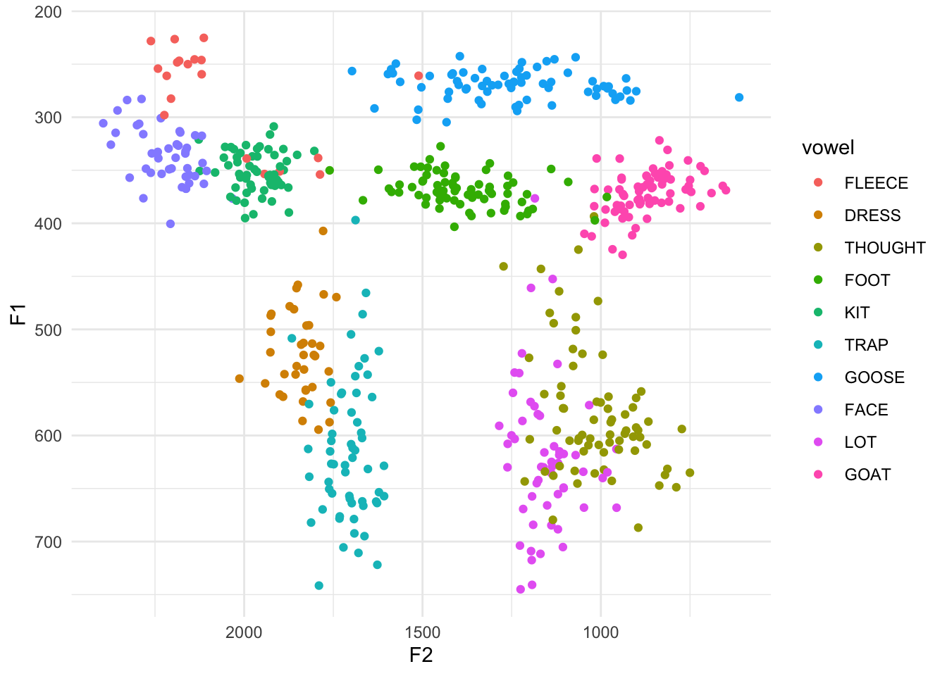
Cool. Now the colors are distinct from one another and the order of the legend is back to an order we might expect.
Adding vowel means
The problem with the plot the way it is, is you still have to constantly check back and forth between the legend and the plot to see what vowel you’re looking at. An easier solution would be to plot the name of the vowel itself inside of its cluster.
One solution that I think I’ve seen before is to use the stat_summary function. Supposedly this works, and if you know how to use it, by all means go for it. I’ve never gotten it to work and I found a workaround that I like that I think offers more flexibility anyway. It involves creating a separate dataset and essentially overlaying a second scatterplot over the main one.
To create this, I pull out some black magic from the dplyr package. First, I start with the midpoints dataset. I then “pipe” it (the %>% function) to the summarize function. This function makes it easy to get summary statistics from your data. We’re creating a new, arbitrarily-named column called mean_F1, which is calculated as the mean of the values in the F1 column. Same thing for mean_F2. However, as it is, we’ll end up with two numbers: the average F1 and F2 of all your data, which would probably be somewhere near the middle of your vowel space.
# A tibble: 1 × 2
  mean_F1 mean_F2
    <dbl>   <dbl>
1    436.   1438.
What we actually want though is the mean F1 and F2 per vowel. So, what we do is insert the group_by function just before summarize. By itself, group_by doesn’t really do much except change some stuff about the dataframe under the hood. But these changes are especially useful when that is then “piped” (%>%) to summarize. Because I did group_by(vowel) first, whatever summary information you want from your dataset will apply to each vowel independently. So, instead of the average overall, you’re getting the average per group. The result is a new dataframe that we’re calling means, that has all the information we want. (I’m then piping it to a print function so we can see the output.)
# A tibble: 10 × 3
   vowel   mean_F1 mean_F2
   <fct>     <dbl>   <dbl>
 1 FLEECE     277.   2068.
 2 DRESS      523.   1842.
 3 THOUGHT    580.   1011.
 4 FOOT       369.   1387.
 5 KIT        351.   1966.
 6 TRAP       613.   1707.
 7 GOOSE      270.   1251.
 8 FACE       337.   2215.
 9 LOT        621.   1153.
10 GOAT       372.    867.
This new dataset, means, is a perfectly good, stand-alone dataset that we can plot by itself. Note that because we called the columns mean_F1 and mean_F2, we’ll have to use those in the ggplot2 function.
ggplot(means, aes(x = mean_F2, y = mean_F1)) +
    geom_point() +
    theme_minimal()
The points themselves aren’t very enlightening. To add some pizzazz, I’m going to use geom_label. This is essentially the same thing at geom_point because it makes a scatterplot, but instead of dots it’ll print these nice little labels. Of course, you have to tell ggplot what text to use for these labels, so we’ll tell it to map the text in the vowel column in the means dataset.
ggplot(means, aes(x = mean_F2, y = mean_F1, label = vowel)) +
    geom_label() +
    theme_minimal()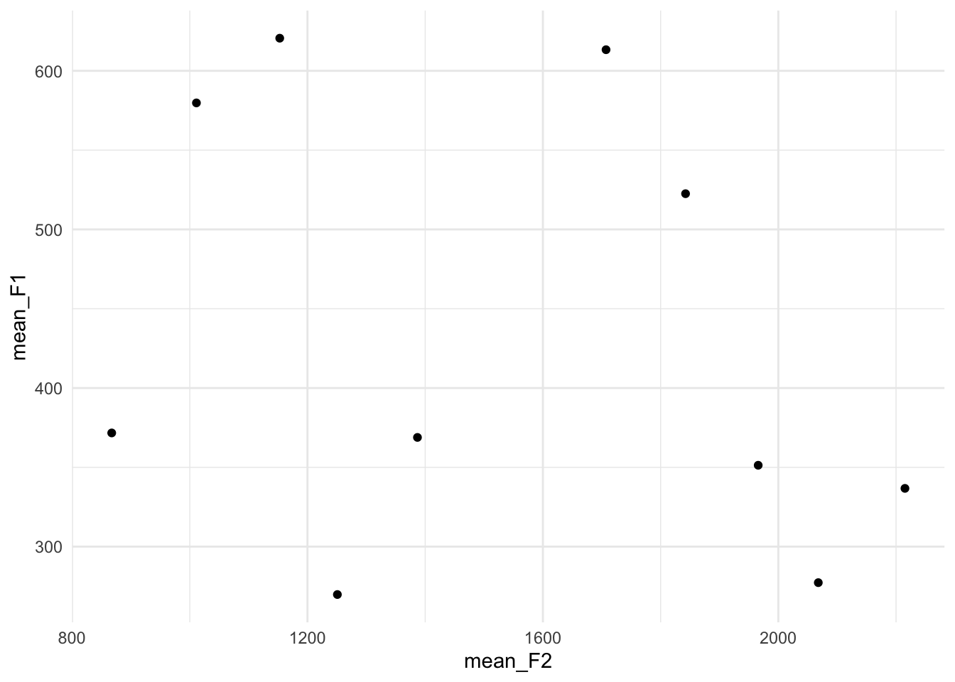
Ooh! Okay, so now we’re getting somewhere. Here it becomes obvious that we need to reverse the x- and y-axes. Let’s do that too.
ggplot(means, aes(x = mean_F2, y = mean_F1, label = vowel)) +
    geom_label() +
    scale_x_reverse() +
    scale_y_reverse() +
    theme_minimal()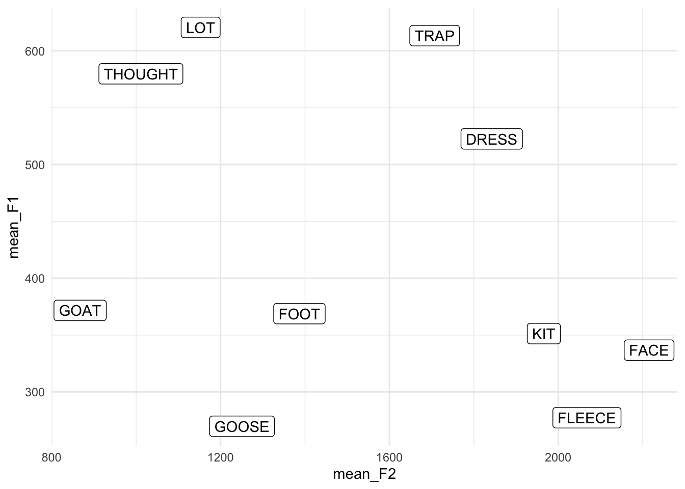
Perfect. So we’ve seen how to plot the points themselves, and now we’ve seen how to plot the means. Now comes the fun part of actually overlaying them into one plot.
It’s perfectly possible to plot two (or more) different datasets in a single visualization, but you’ll have to be careful about the aes() functions. Anything in the ggplot(aes()) function will apply to all other layers, unless they’re overridden. That’s why we didn’t need to provide any additional information in geom_point because it inherited all its information (the data, the axes, the color) from ggplot.
If we want to add the means, we’re using a different dataset, so that right off that bat has to be overridden in our geom_label function:
    # Don't plot this yet...
    ...
    geom_label(data = means) +
    ...
Because we’re using geom_label, we’re going to need to put label = vowel somewhere. You can put it in the main ggplot(aes()) function with everything else and that’ll work out fine:
# Don't plot this yet...
ggplot(midpoints, aes(x = F2, y = F1, color = vowel, label = vowel)) +
    ...
    geom_label(data = means) +
    ...
However, we’re going to have to supply our own aes() function within geom_label. The reason for that is because right now we’ve got x = F2 and y = F1 as global settings. Our new means dataframe doesn’t have columns with those names. So we’ll have to override these by adding a second aes() function, this time within geom_label:
# Still don't run this.
ggplot(midpoints, aes(x = F2, y = F1, color = vowel, label = vowel)) +
    ...
    geom_label(data = means, aes(x = mean_F2, y = mean_F1)) +
Add all the other pieces to the plot, and let’er rip.
ggplot(midpoints, aes(x = F2, y = F1, color = vowel, label = vowel)) +
    geom_point() +
    geom_label(data = means, aes(x = mean_F2, y = mean_F1)) +
    scale_x_reverse() +
    scale_y_reverse() +
    scale_color_discrete(breaks = c("FLEECE", "KIT", "FACE", "DRESS", "TRAP",
                                    "LOT", "THOUGHT", "GOAT", "FOOT", "GOOSE"))  +
    theme_minimal()
Aha! So now we have a vowel plot that has the points, and on top of them it has the labels for these vowels right where the averages are. Pretty cool.
A couple things to note here. In the legend, notice that the dots have now all turned into little a’s because we’re using geom_label now. But, something to consider is this: what additional information is the legend providing us? The answer is nothing. There is nothing that the legend says that we can’t already get from the plot. So, to create a cleaner plot with less visual clutter, we really should remove the legend. We can do this with theme(legend.position = "none"). And now that we’ve removed the legend, we can remove the breaks = c(...) argument to scale_color_discrete since there’s no point in modifying the order of elements in a non-existent legend.
ggplot(midpoints, aes(x = F2, y = F1, color = vowel, label = vowel)) +
    geom_point() +
    geom_label(data = means, aes(x = mean_F2, y = mean_F1)) +
    scale_x_reverse() +
    scale_y_reverse() +
    scale_color_discrete() +
    theme_minimal() +
    theme(legend.position = "none")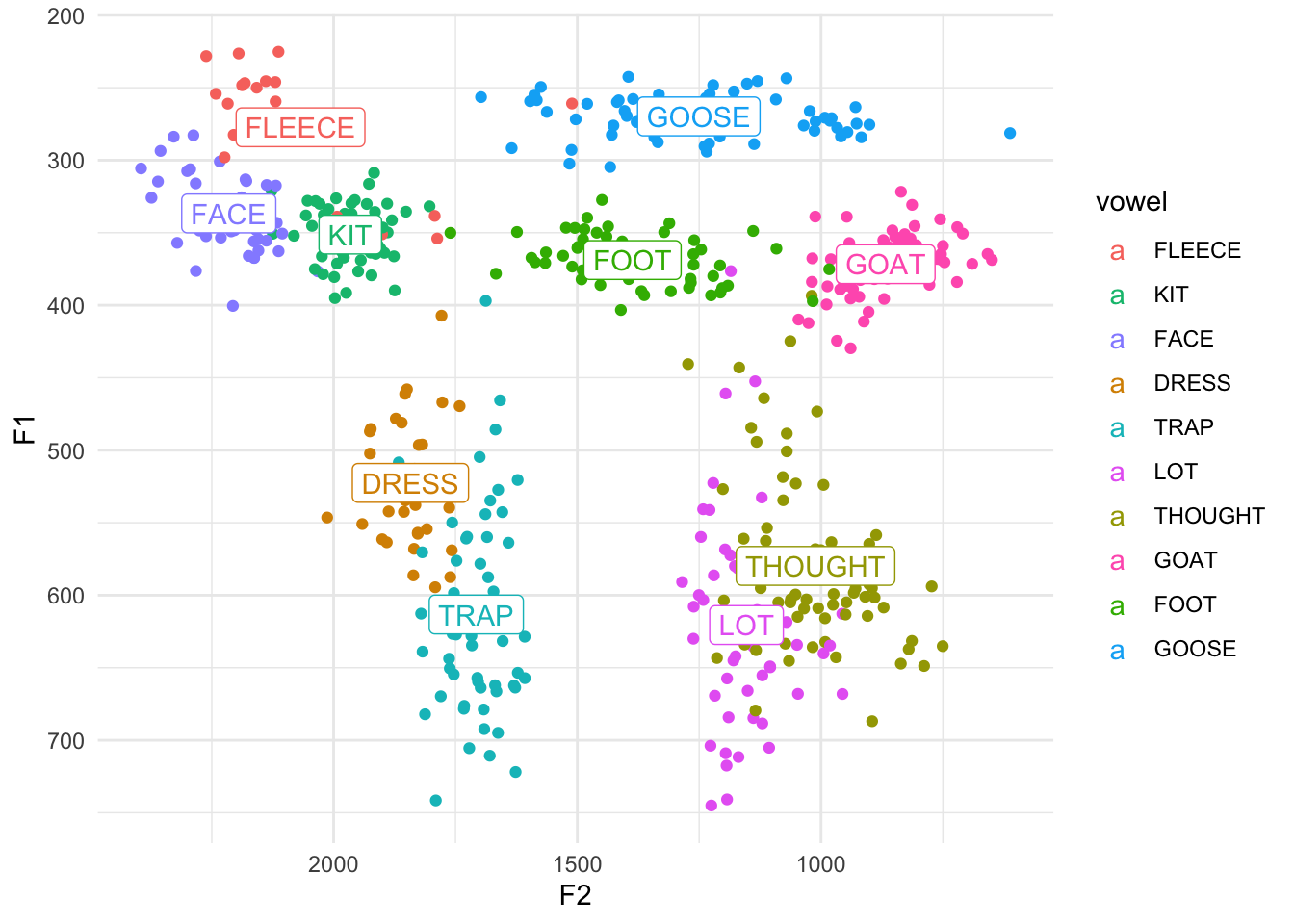
Another thing to notice is that the labels are automatically colored the same as the vowels! How did it do that? We’ll, as it turns out, geom_label inherited the color = vowel argument from the main ggplot(aes()) function. It worked because it just so happens that the column vowel exists in both the means and the midpoints datasets. Pretty cool. If you want to override it, perhaps by making them all black, you can certainly do so. Just put it within geom_label but not inside of aes:
ggplot(midpoints, aes(x = F2, y = F1, color = vowel, label = vowel)) +
    geom_point() +
    geom_label(data = means, aes(x = mean_F2, y = mean_F1), color = "black") +
    scale_x_reverse() +
    scale_y_reverse() +
    scale_color_discrete() +
    theme_minimal() +
    theme(legend.position = "none")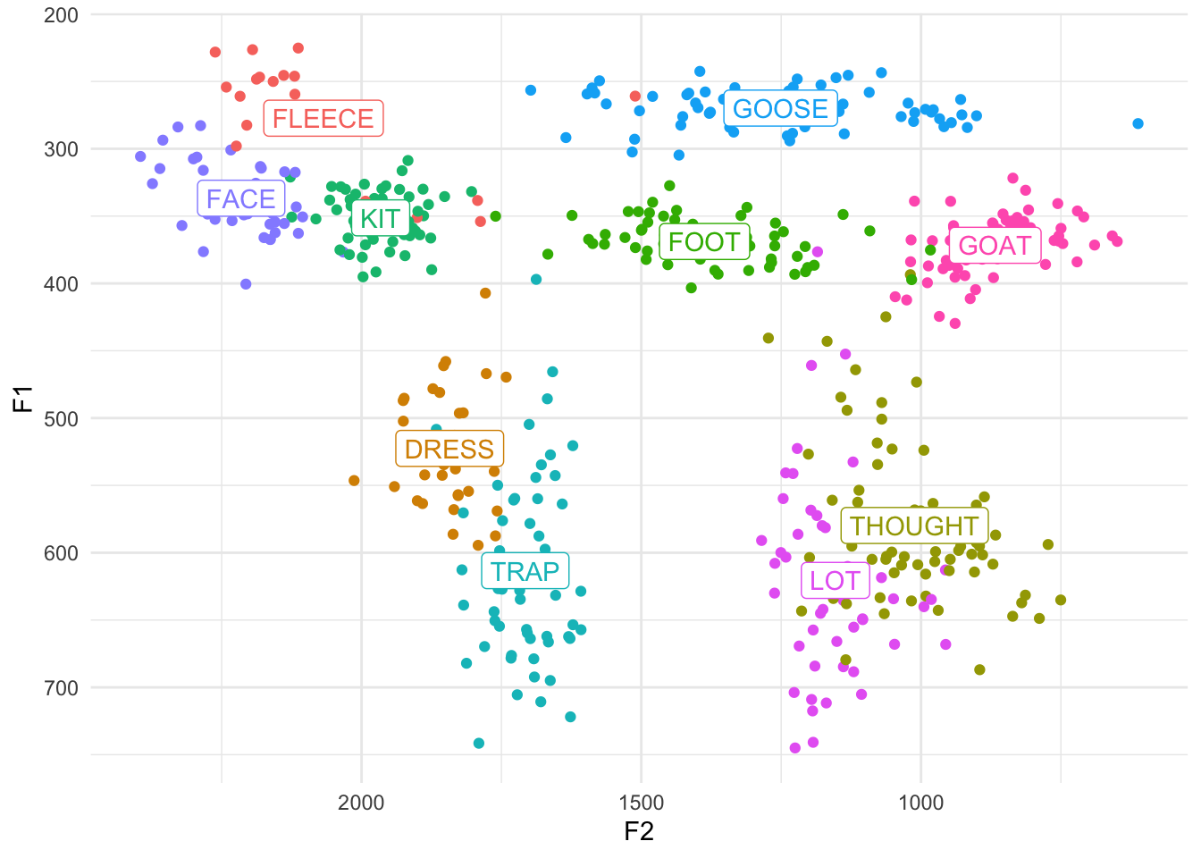
If course, now it’s not quite as clear which cluster the labels belong to. It’s up to you.
Tangent: An alternative approach
Side note, we could have saved ourselves some headache by planning ahead. When we created the means dataframe, we could have called the new columns F1 and F2 to match the columns in midpoints. By doing that, we wouldn’t need to override the x and y arguments. All of that code would look like this.
means <- midpoints %>%
    group_by(vowel) %>%
    summarize(F1 = mean(F1),
              F2 = mean(F2))
ggplot(midpoints, aes(x = F2, y = F1, color = vowel, label = vowel)) +
    geom_point() +
    geom_label(data = means) +
    scale_x_reverse() +
    scale_y_reverse() +
    scale_color_discrete() +
    theme_minimal() +
    theme(legend.position = "none")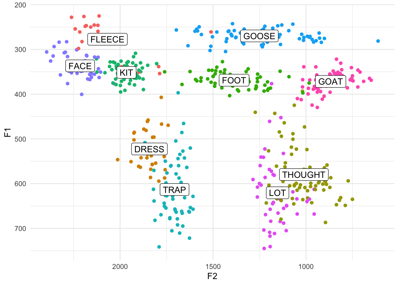
And if you want to get really fancy, you can use the across function if you’d like. Don’t worry about it if you don’t quite get what’s happening.
Ellipses
One final thing that would be good to show in a vowel plot are ellipses. These are often used to get an idea of the distribution of the vowels or to show degree of overlap. Fortunately, they’re pretty easy to implement (a lot easier than means at least). The main function that takes care of these is stat_ellipse.
ggplot(midpoints, aes(x = F2, y = F1, color = vowel, label = vowel)) +
    geom_point() +
    geom_label(data = means, color = "black") +
    stat_ellipse() +
    scale_x_reverse() + scale_y_reverse() +
    scale_color_discrete() +
    theme_minimal() +
    theme(legend.position = "none")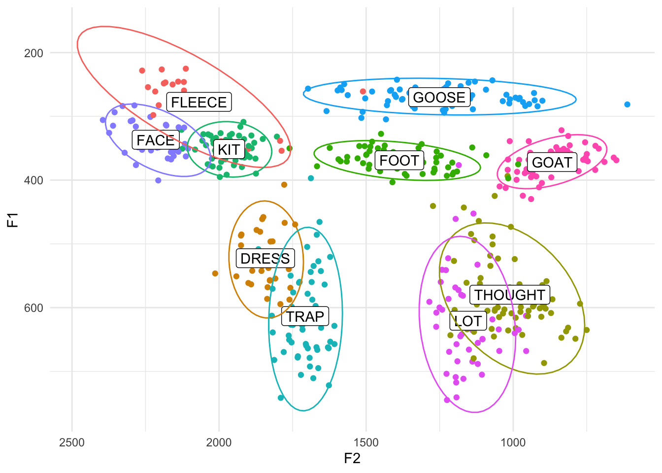
Easy-peasy. By default, these ellipses cover about a 95% confidence interval (or approximately two standard deviations) around the means of each vowel. We can change that to whatever we want using the level function. I usually set mine to 0.67, which corresponds to about one standard deviation, and I think that’s pretty standard for people who make vowel plots. This only changes the size of the ellipses, leaving shape/orientation the same.
ggplot(midpoints, aes(x = F2, y = F1, color = vowel, label = vowel)) +
    geom_point() +
    geom_label(data = means, color = "black") +
    stat_ellipse(level = 0.67) +
    scale_x_reverse() +
    scale_y_reverse() +
    scale_color_discrete() +
    theme_minimal() +
    theme(legend.position = "none")
Tangent: Ordering
You might be wondering why I order the layers in the block of code the way I do. For the most part, the order doesn’t matter, but for some things it does. So if you look carefully at the above plot, you’ll see that the ellipses lines actually cover the labels. The reason for that is simply because the stat_ellipse function came after geom_label in the block. I think it looks better with the labels on top, so you can switch those.
ggplot(midpoints, aes(x = F2, y = F1, color = vowel, label = vowel)) +
    geom_point() +
    stat_ellipse(level = 0.67) +
    geom_label(data = means, color = "black") +
    scale_x_reverse() +
    scale_y_reverse() +
    scale_color_discrete() +
    theme_minimal() +
    theme(legend.position = "none")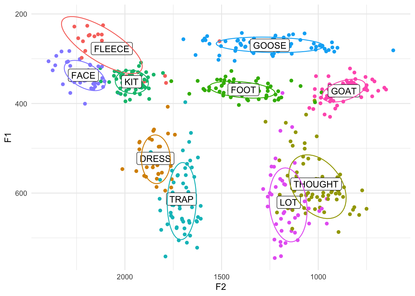
Another piece of ordering that matters is theme_classic and theme(). The second one, which removes the legend, must go after theme_classic. Basically, the reason is theme_classic has theme built into it, and it specifies that the legend goes on the right side. So if you put theme first, it’ll get overwritten by theme_classic. But if you put theme after, it’ll overwrite things in theme_classic.
As far as I can tell, most of the other things like scale_x_reverse, scale_y_reverse, and scale_color_discrete can go anywhere. Generally, I order my block with the important things first (like geom_point since this is a scatterplot after all), then the small cosmetic changes (like scale_x_reverse), and then any themes.
Making the ellipses the focus
Sometimes, you just have too much data and you lose the forest for the trees with all those points. You can easy remove them and leave just the means and the ellipses by removing (or just commenting out) the geom_point line.
ggplot(midpoints, aes(x = F2, y = F1, color = vowel, label = vowel)) +
    #geom_point() +
    stat_ellipse(level = 0.67) +
    geom_label(data = means) +
    scale_x_reverse() +
    scale_y_reverse() +
    scale_color_discrete() +
    theme_minimal() +
    theme(legend.position = "none")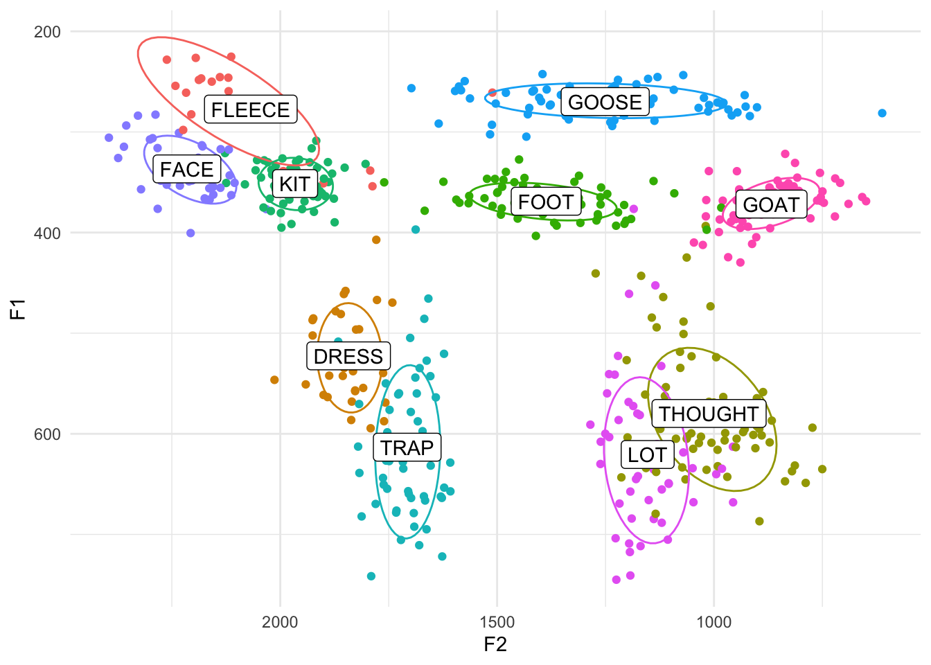
That’s one way to clean it up. We could also keep them but make them a bit transparent by adding the alpha argument. The range of values for alpha is from 0 to 1, with 1 being completely opaque and 0 being invisible. An alpha level of 0.2 means that it takes 5 (0.2 = 1/5) overlapping points to become completely opaque. In other words it’s only shaded in 20%.
ggplot(midpoints, aes(x = F2, y = F1, color = vowel, label = vowel)) +
    geom_point(alpha = 0.2) +
    stat_ellipse(level = 0.67) +
    geom_label(data = means) +
    scale_x_reverse() +
    scale_y_reverse() +
    scale_color_discrete() +
    theme_minimal() +
    theme(legend.position = "none")
We could also change the size so that they’re smaller. I’ve found that the exact size depends on how much data you’re displaying, but if you make it smaller than the default of 1.5, you might have a slightly cleaner plot. I’ll make mine about half the default size by adding size = 0.75 within geom_point.
ggplot(midpoints, aes(x = F2, y = F1, color = vowel, label = vowel)) +
    geom_point(size = 0.75) +
    stat_ellipse(level = 0.67) +
    geom_label(data = means) +
    scale_x_reverse() +
    scale_y_reverse() +
    scale_color_discrete() +
    theme_minimal() +
    theme(legend.position = "none")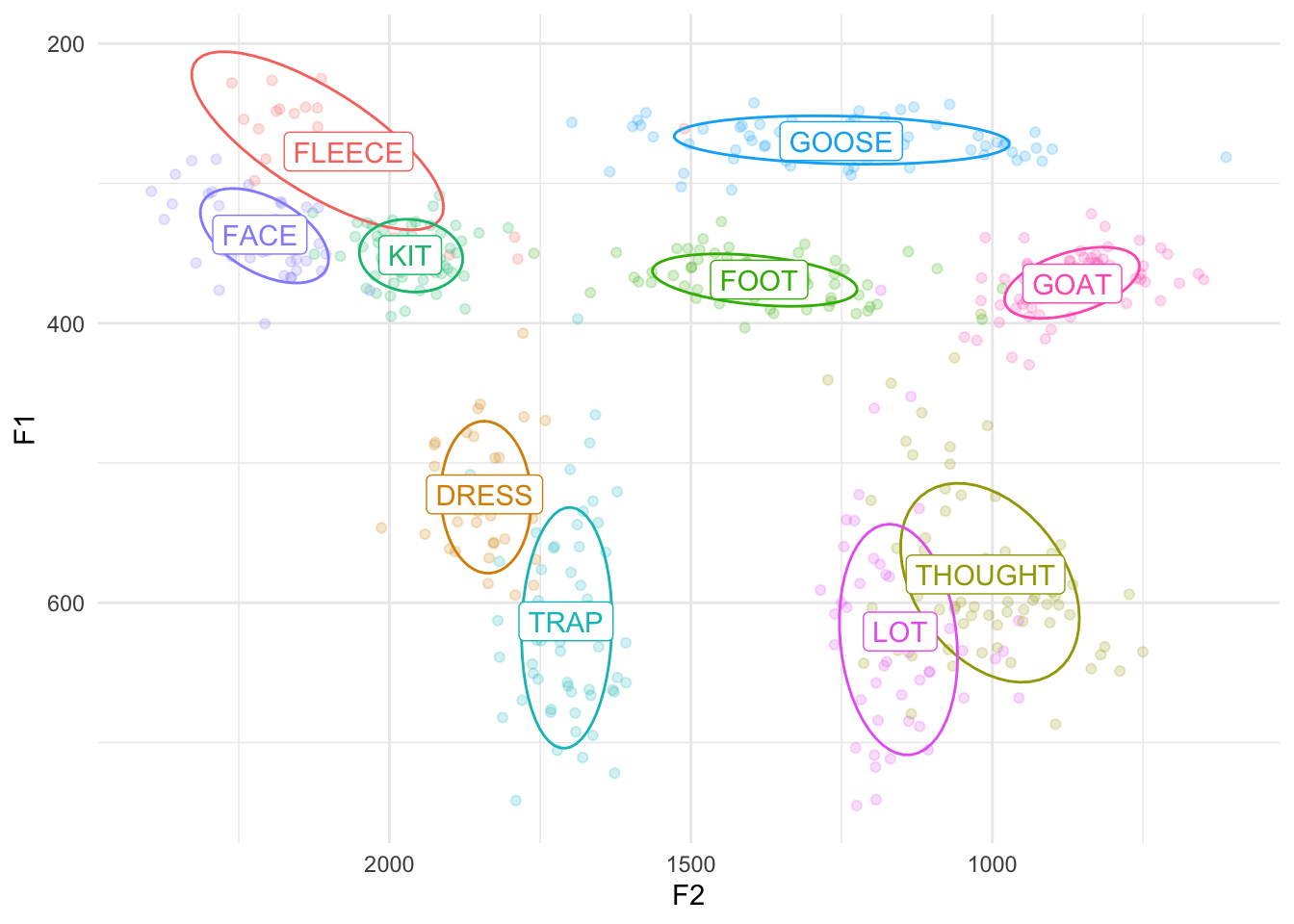
You could even change the size to a lot smaller, like 0.1 or even 0.01. You could also keep them relatively large but change the transparency as well (size = 2, alpha = 0.5). The sky’s the limit!
ggplot(midpoints, aes(x = F2, y = F1, color = vowel, label = vowel)) +
    geom_point(size = 1, alpha = 0.5) +
    stat_ellipse(level = 0.67) +
    geom_label(data = means) +
    scale_x_reverse() +
    scale_y_reverse() +
    scale_color_discrete() +
    theme_minimal() +
    theme(legend.position = "none")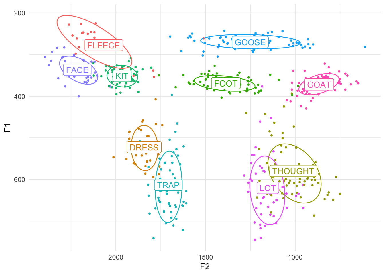
Shaded ellipses
I want to touch on how to shade the ellipses in. This takes slightly more finagling within stat_ellipse, but the result is pretty cool.
The main argument that you need to add is geom = "polygon" within stat_ellipse. Try that and see what the result is:
ggplot(midpoints, aes(x = F2, y = F1, color = vowel, label = vowel)) +
    stat_ellipse(level = 0.67, geom = "polygon") +
    geom_label(data = means) +
    scale_x_reverse() +
    scale_y_reverse() +
    scale_color_discrete() +
    theme_minimal() +
    theme(legend.position = "none")
Okay, so that has the effect of filling them all in black. It’s good that we got them filled in, but that’s probably not exactly what we had in mind though. Let’s make them all a bit transparent by adding the alpha = 0.2 argument as a part of stat_ellipse.
ggplot(midpoints, aes(x = F2, y = F1, color = vowel, label = vowel)) +
    stat_ellipse(level = 0.67, geom = "polygon", alpha = 0.1) +
    geom_label(data = means) +
    scale_x_reverse() +
    scale_y_reverse() +
    scale_color_discrete() +
    theme_minimal() +
    theme(legend.position = "none")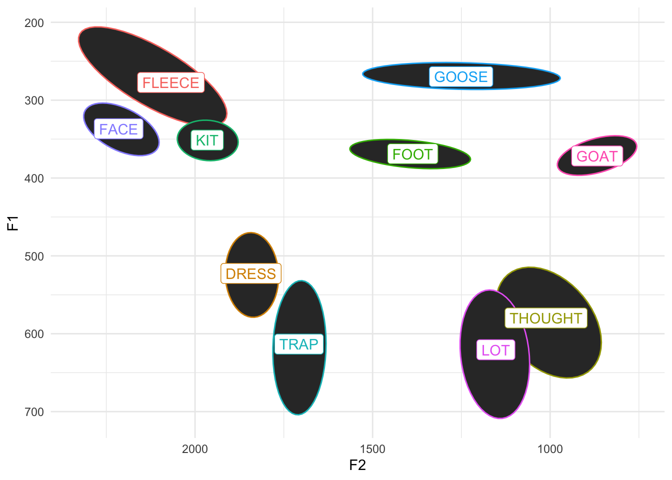
Finally, we can actually color these ellipses based on the vowels themselves by adding fill = vowel to our aes function:
ggplot(midpoints, aes(x = F2, y = F1, color = vowel, label = vowel, fill = vowel)) +
    stat_ellipse(level = 0.67, geom = "polygon", alpha = 0.1) +
    geom_label(data = means) +
    scale_x_reverse() +
    scale_y_reverse() +
    scale_color_discrete() +
    theme_minimal() +
    theme(legend.position = "none")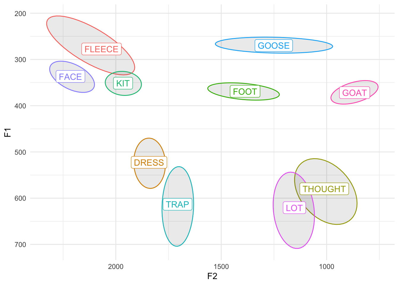
Whoops! What did that do? Yes, the ellipses are shaded in correctly, but now the labels are too! Turns out, in geom_label, the fill argument also modifies the background color, which is normally white. We could either override the fill on geom_label and set it to "white", or, better yet, let’s just add aes(fill = vowel) just to stat_ellipse to prevent any other potential bugs.
ggplot(midpoints, aes(x = F2, y = F1, color = vowel, label = vowel)) +
    stat_ellipse(level = 0.67, geom = "polygon", alpha = 0.1, aes(fill = vowel)) +
    geom_label(data = means) +
    scale_x_reverse() +
    scale_y_reverse() +
    scale_color_discrete() +
    theme_minimal() +
    theme(legend.position = "none")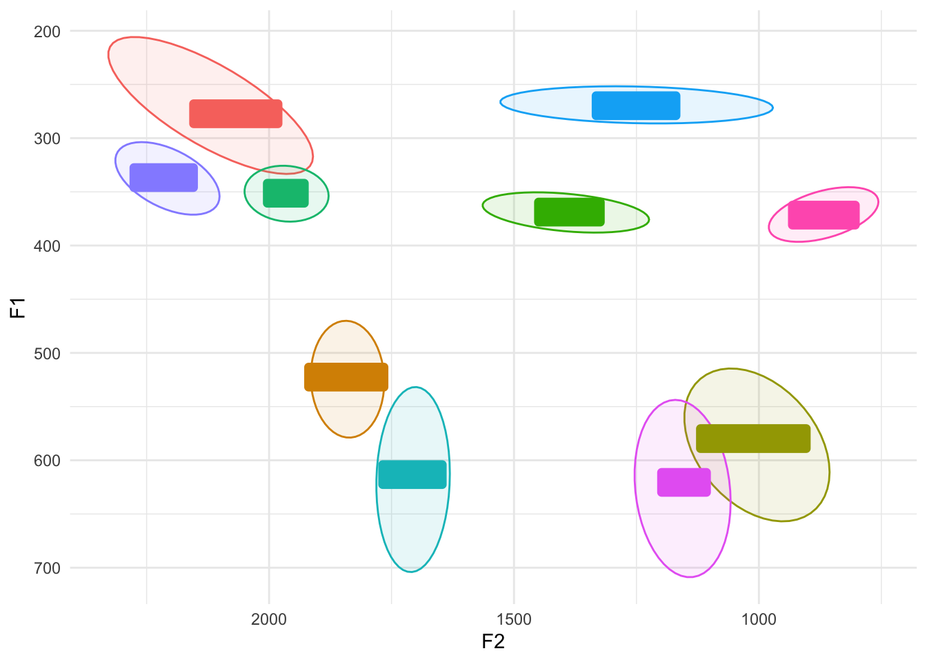
Aha. Now we get the desired result. So shaded ellipses are cool especially if the data is pretty clean like this. If you’ve got messier data, things can get a little muddy, partially because we have so many vowels in English. If you’re only working with a subset of English vowels or a language with fewer vowels, it’ll look a little crisper, even if you add the points back in. I’ll just take five vowels and plot them, and I’ll even add shape in there too for fun. (Can you see how I did that?)
my_five_vowels <- subset(midpoints, vowel %in% c("FLEECE", "FACE", "LOT", "GOAT", "GOOSE"))
five_means <- my_five_vowels %>%
    group_by(vowel) %>%
    summarize(F1 = mean(F1),
              F2 = mean(F2))
ggplot(my_five_vowels, aes(x = F2, y = F1, color = vowel, label = vowel, shape = vowel)) +
    geom_point() +
    stat_ellipse(level = 0.67, geom = "polygon", alpha = 0.1, aes(fill = vowel)) +
    geom_label(data = five_means, aes(x = F2, y = F1)) +
    scale_x_reverse() +
    scale_y_reverse() +
    scale_color_discrete() +
    theme_minimal() +
    theme(legend.position = "none")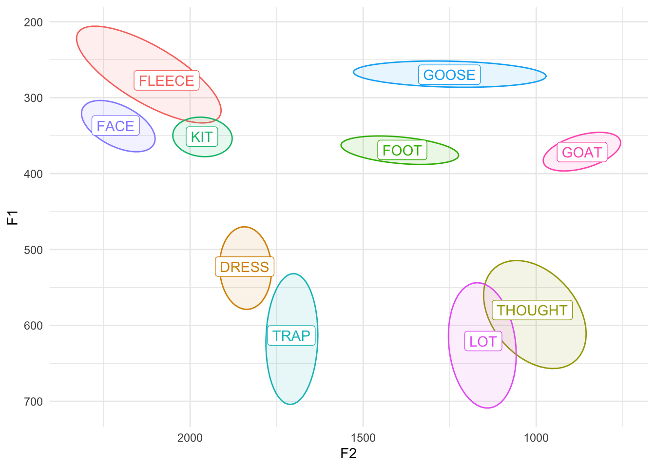
Text instead of points
Okay, last thing, I promise. If your dataset is relatively small, a really slick trick is to plot the words themselves rather than points. We saw how to do this above when we were plotting the means, but let’s apply that to the regular data. For this example, I’ll just zoom in on my LOT and THOUGHT vowels to look at my phonetically close but phonologically distinct low back vowels.
So here’s what this would look like with points.
ggplot(cot_caught, aes(x = F2, y = F1, color = vowel, label = vowel, shape = vowel)) +
    geom_point(size = 2) +
    stat_ellipse(level = 0.67, geom = "polygon", alpha = 0.1, aes(fill = vowel)) +
    geom_label(data = cot_caught_means) +
    scale_x_reverse() +
    scale_y_reverse() +
    scale_color_discrete() +
    theme_minimal() +
    theme(legend.position = "none")
The trick here is to use geom_text instead of geom_point. Note that geom_text is very similar to geom_label, which is what we used for the means. The only difference I’ve been able to see is that there’s a nice little box around geom_label and not one for geom_text.
ggplot(cot_caught, aes(x = F2, y = F1, color = vowel, label = vowel, shape = vowel)) +
    geom_text() +
    stat_ellipse(level = 0.67, geom = "polygon", alpha = 0.1, aes(fill = vowel)) +
    geom_label(data = cot_caught_means) +
    scale_x_reverse() +
    scale_y_reverse() +
    scale_color_discrete() +
    theme_minimal() +
    theme(legend.position = "none")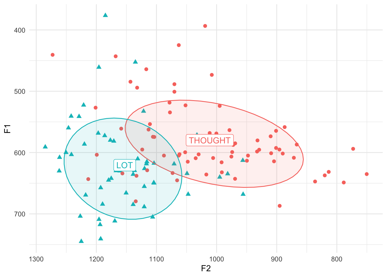
Oops! That’s not what we wanted! For the means, yes, we want the vowel. But for the points we want the actual word. This means we have to add label = word to our code somewhere. For clarity, I’ll move label = vowel out of ggplot(aes() and into geom_label(aes()). That way there is no default label and every time we call geom_text or geom_label we need to specify label individually. (Also, I’ll get rid of shape = vowel since that’s not being used anymore.)
ggplot(cot_caught, aes(x = F2, y = F1, color = vowel)) +
    geom_text(aes(label = word)) +
    stat_ellipse(level = 0.67, geom = "polygon", alpha = 0.1, aes(fill = vowel)) +
    geom_label(data = cot_caught_means, aes(label = vowel)) +
    scale_x_reverse() +
    scale_y_reverse() +
    scale_color_discrete() +
    theme_minimal() +
    theme(legend.position = "none")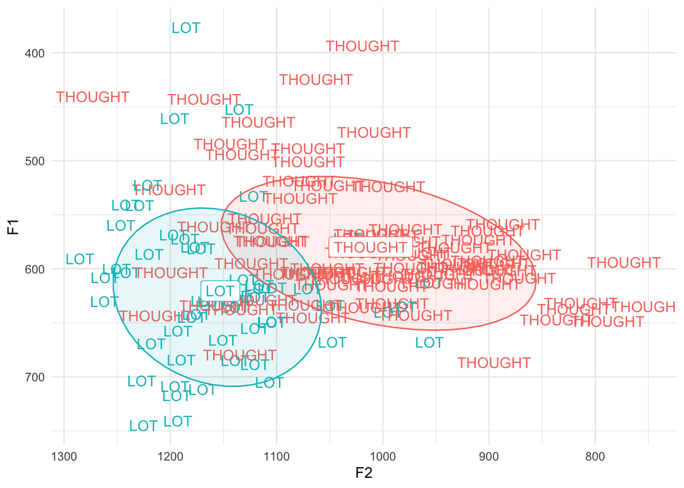
Aha! There we go. So this is a way to make a plot look cooler. Especially if individual lexical items are part of your analysis and particularly if you don’t have a lot of data to show at once. If you want, try it with the full dataset just to see how not helpful it is, but be aware that it can be slow to render if you have a lot of data to show.
Final remarks
The way you present your data is all up to you. I often prefer a set of settings when I’m playing around with my data, but then switch to a different set when I want to copy and paste into a presentation or paper. It’s good to be comfortable enough with ggplot2 so that you know what is going on and what changes you can make. Hopefully this tutorial has made a few things clearer.
Reuse
CC-BY-SA-4.0
Citation
BibTeX citation:
@online{a._stanley2022,
  author = {A. Stanley, Joseph},
  title = {Vowel {Plots} with `Ggplot2`},
  series = {Linguistics Methods Hub},
  date = {2022-10-18},
  url = {https://lingmethodshub.github.io/content/R/vowel-plots-tutorial/},
  doi = {10.5281/zenodo.7222149},
  langid = {en}
}
For attribution, please cite this work as:
A. Stanley, Joseph. 2022, October 18. Vowel Plots with `ggplot2`.
Linguistics Methods Hub. (https://lingmethodshub.github.io/content/R/vowel-plots-tutorial/).
doi: 10.5281/zenodo.7222149