
# Setup
library(tidyverse)
library(brms)
library(ggdist)
library(marginaleffects)
library(faux)
library(tinytable)

theme_set(
  theme_ggdist() +
  theme(
    palette.colour.discrete = khroma::color(palette = "bright")
  )
)

options(
  tinytable_tt_digits = 3,
  marginaleffects_lean = TRUE,
  marginaleffects_posterior_center = "mean"
)
set.seed(2026)Using {marginaleffects} to understand statistical models
This is a tutorial about how to use the {marginaleffects} package to extract and plot predictions of interest from a statistical model.
NoteTutorial data
data/um_data.csv (4.7Mb)
The purpose of this tutorial is to introduce use of the marginaleffects package with linguistic data. The use of linguistic data is the distinctive aspect of this tutorial, which otherwise partially replicates the tutorials available by the author of marginaleffects and collaborators (Arel-Bundock & Greifer & Heiss 2024; Arel-Bundock 2025; 2026). I highly recommend referring to these materials as well, especially the book and reference manual at https://marginaleffects.com.
While the use of marginaleffects is often discussed within the framework of Causal Inference, it is very useful for extracting predictions and comparisons from statistical models even if you’re not operating within that framework. This tutorial will use brms to fit the model, but the incredible utility of marginaleffects is its support for an enormous range of models (123 at time of writing) from a broad range of packages using a common interface. So, even if you’re modeling using lme4 or base stats::lm() or stats::glm(), you should be able to make use of the functions covered in this tutorial with minimal adjustment.
Introduction: Filled Pause Data
We’ll be modelling the use of Filled Pauses (“um” and “uh”) drawn from the Philadelphia Neighborhood Corpus (filled pause background: Clark & Fox Tree (2002); Wieling et al. (2016); Fruehwald (2016)).
um = read_csv("data/um_data.csv")Table code
| speaker | age | gender | year | dob | label | local_speaking | local_syls | local_rate | total_speaking | total_syl | total_rate | prev_speaker | fol_seg | fol_dur |
|---|---|---|---|---|---|---|---|---|---|---|---|---|---|---|
| s_108 | 29 | woman | 1990 | 1961 | UM | 1.33 | 7 | 5.26 | 611.3 | 3402 | 5.57 | 0 | sp | 0.36 |
| s_262 | 38 | woman | 1987 | 1949 | UM | 1.08 | 3 | 2.78 | 518.4 | 2934 | 5.66 | 0 | sp | 0.14 |
| s_096 | 32 | woman | 1984 | 1952 | UM | 0.77 | 2 | 2.59 | 580.25 | 2873 | 4.95 | 0 | sp | 0.79 |
| s_075 | 55 | man | 2010 | 1955 | UH | 1 | 9 | 9 | 1042.85 | 5987 | 5.74 | 0 | AH1 | 0.03 |
| s_095 | 41 | man | 1974 | 1933 | UH | 1.18 | 7 | 5.93 | 932.77 | 5086 | 5.45 | 0 | sp | 0.19 |
| s_078 | 57 | man | 1985 | 1928 | UH | 1.29 | 6 | 4.65 | 737.95 | 3543 | 4.8 | 0 | AH0 | 0.06 |
Every row corresponds to either an “um” or an “uh”. The data columns that may not be obvious from the names are:
-
local_*: quantities estimated based on a 1 second window around each filled pause*_speaking: total duration of words spoken*_syls: The number of syllables spoken*_rate: The number of syllables divided by the speaking time.
-
total_*: Quantities estimated based on the speaker’s entire interview.-
*_speaking,*_syls,*_rate: same as for the local quantities
-
prev_speaker: If 0, the previous speaker in the recording was the the same as the focal speaker. If any other number, it was a different speaker.fol_seg: The phone following the filled pause.spis a pause, and every other value is a CMU-style label.fol_dur: The duration of the following phone.
Descriptive stats
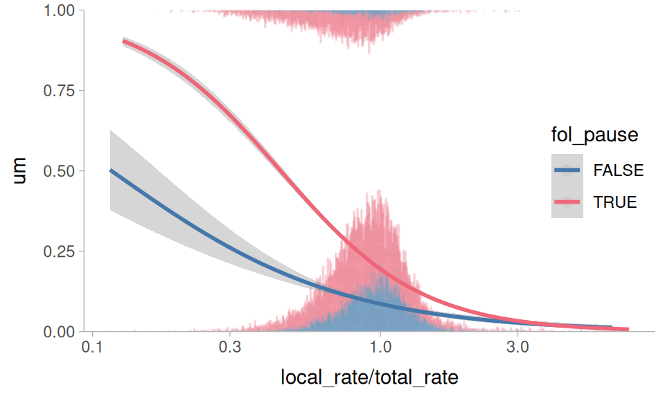
Clark & Fox Tree (2002) argue that filled pauses are useful signals to a listener that a speaker is working harder for lexical access, and that “um” is a signal of greater effort than “uh”. As such, other indicators of greater effort in lexical access should be predictive of “um” usage, such as whether or not there is a silent pause following, and slowdowns in local speech rate.
Figure 1 plots “um” usage against the relative speech rate (how much faster/slower the local speech rate around the filled pause is relative to the speaker’s overall speech rate) and whether or not the following segment was a silent pause. It appears to hold true that a following silent pause is predictive of higher “um” usage, and so is a slower relative speech rate.
Plotting code
um |>
 mutate(
   um = (label == "UM") * 1,
   fol_pause = fol_seg == "sp"
 ) |>
 ggplot(
   aes(local_rate/total_rate, um, color = fol_pause)
 ) +
 geom_dots(
   aes(
     side = label,
     order = fol_pause
   ),
   height = 0.5,
   group = NA,
   alpha = 0.1
 ) +
 stat_smooth(
   method = glm,
   method.args = list(
     family = binomial
   )
 ) +
 scale_side_mirrored(
   guide = "none"
 ) +
 scale_x_log10() +
 scale_y_continuous(
   expand = expansion(0)
 ) +
 coord_cartesian(
   y = c(0,1)
 ) +
 theme_sub_legend(
   position = "inside",
   position.inside = c(0.9,0.5)
 )
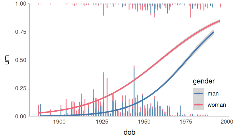
Wieling et al. (2016) and Fruehwald (2016) also found that there appears to be a language change in progress, with speakers shifting towards higher “um” usage. As with most language changes in progress, women are in the lead. Figure 2 plots these relationships in the data.
Plotting code
um |>
 mutate(
   um = (label == "UM") * 1,
 ) |>
 ggplot(
   aes(dob, um, color = gender)
 ) +
 geom_dots(
   aes(
     side = label,
     order = gender
   ),
   height = 0.5,
   group = NA,
   alpha = 0.1
 ) +
 stat_smooth(
   method = glm,
   method.args = list(
     family = binomial
   )
 ) +
 scale_side_mirrored(
   guide = "none"
 ) +
 scale_x_log10() +
 scale_y_continuous(
   expand = expansion(0)
 ) +
 coord_cartesian(
   y = c(0,1)
 ) +
 theme_sub_legend(
   position = "inside",
   position.inside = c(0.9,0.2)
 )
Preparing the data
For modeling, I’ll fit a logistic regression predicting “um” (vs “uh”) usage. I’ll calculate some derived predictors, specifically the relative speech rate, and categorical predictor encoding whether the following sound was a silent pause, a vowel, or a consonant. I’ll also use sum contrasts for all of the predictors.
um |>
  mutate(
    um = (label == "UM")*1,
    relative_rate = local_rate/total_rate,
    fol_class = case_when(
      fol_seg == "sp" ~ "pause",
      str_detect(fol_seg, "[AEIOU]") ~ "vowel",
      .default = "consonant"
    ) |> contr_code_sum(),
    gender = contr_code_sum(gender)
  ) ->
  to_mod
To aid with model fitting, I’ll need some summary statistics for the between-speaker variables.
um |>
  slice(
    .by = speaker, 1
  ) |>
  summarise(
    across(
      c(dob, starts_with("total")),
      mean
    )
  )
# A tibble: 1 × 4
dob total_speaking total_syl total_rate
<dbl> <dbl> <dbl> <dbl>
1 1943. 861. 4558. 5.30Fitting the model
For fitting the model, I want to take into account the fact that
“um” usage is shifting over DOB, possibly at different rates for men and women.
The rate of speech and following pause effects may change as the overall rate of “um” usage increases.
Speakers who are already fast speakers might not have as strong a relative speech rate effect.
Taking all of these things into account results in this monstrous model formula. I’m centering and log transforming the predictors inside the model formula, because this will eventually play nicer with the marginaleffects functions.
In case you missed it, that’s a five way interaction. Now we’ll fit it using brms and default priors.
This model results in 48 fixed effects estimates, and because they’re all involved in interactions, none of them can be straightforwardly interpreted.
Table code
fixef(um_model) |>
 as_tibble(rownames = "term") ->
 fixef_df

reliable <- function(lo, hi){
  sign(lo) == sign(hi)
}

fixef_df |>
 mutate(
   dob = case_when(
     str_detect(term, "dob") ~ "dob"
   ),
   gender = case_when(
     str_detect(term, "gender") ~ "man"
   ),
   fol_class = case_when(
     str_detect(term, "fol_class") ~ str_extract(
       term, "fol_class.([a-z]+)M", group = 1
     )
   ),
   total_rate = case_when(
     str_detect(term, "total_rate") ~ "total_rate"
   ),
   rel_rate = case_when(
     str_detect(term, "relative_rate") ~ "rel_rate"
   )
 ) |>
 relocate(
   dob:last_col(),
   .before = term
 ) |>
 select(-term) |>
 slice(-1) ->
 param_df

param_df |>
 tt() |>
 tt_format(
   replace = TRUE
 ) |>
 tt_format(
   j = 6:9,
   digits = 3,
   num_fmt = "decimal"
 ) |>
 tt_style(
   i = 1:nrow(param_df),
   bold = reliable(
     param_df$Q2.5, param_df$Q97.5
   )
 ) |>
 theme_html(
   engine = "tabulator",
   tabulator_pagination = c(10, 25, 50)
)From model to meaning
Getting predictions
We can get the probability of “um” the model assigns to each token with marginaleffects::predictions(). Without passing any other arguments, it will give us back predictions for the original data.
predictions(
  um_model
) ->
 all_pred
Table code
all_pred|>
 slice_sample(
   by = label,
   n = 3
 ) |>
 tt() |>
 tt_style(
   fontsize = 0.6
)| rowid | estimate | conf.low | conf.high | speaker | age | gender | year | dob | label | local_speaking | local_syls | local_rate | total_speaking | total_syl | total_rate | prev_speaker | fol_seg | fol_dur | um | relative_rate | fol_class | df |
|---|---|---|---|---|---|---|---|---|---|---|---|---|---|---|---|---|---|---|---|---|---|---|
| 16919 | 0.6723 | 0.4721 | 0.8404 | s_010 | 65 | man | 2006 | 1941 | UM | 0.488 | 1 | 2.05 | 1705 | 8600 | 5.04 | 3 | sp | 0.08 | 1 | 0.406 | pause | Inf |
| 22759 | 0.8658 | 0.761 | 0.9452 | s_194 | 18 | man | 2000 | 1982 | UM | 1.021 | 5 | 4.9 | 1615 | 9887 | 6.12 | 0 | sp | 0.169 | 1 | 0.8 | pause | Inf |
| 22010 | 0.3568 | 0.1957 | 0.5435 | s_072 | 45 | man | 1997 | 1952 | UM | 1.06 | 5 | 4.72 | 718 | 3919 | 5.46 | 0 | sp | 0.32 | 1 | 0.864 | pause | Inf |
| 14210 | 0.0166 | 0.0012 | 0.0598 | s_058 | 69 | woman | 1982 | 1913 | UH | 1.32 | 5 | 3.79 | 881 | 4592 | 5.21 | 0 | sp | 0.09 | 0 | 0.727 | pause | Inf |
| 27858 | 0.2748 | 0.1149 | 0.4785 | s_304 | 65 | woman | 2006 | 1941 | UH | 0.648 | 2 | 3.09 | 2170 | 12956 | 5.97 | 0 | sp | 0.19 | 0 | 0.517 | pause | Inf |
| 9852 | 0.0912 | 0.0445 | 0.1546 | s_044 | 24 | man | 1996 | 1972 | UH | 0.641 | 2 | 3.12 | 1333 | 8411 | 6.31 | 0 | sp | 0.23 | 0 | 0.494 | pause | Inf |
Average predictions
One thing we could ask is what the average prediction for, say, the fol_class variable is. To get that, we can do some tidyverse summarizing on all_pred. This is also called “marginalizing” over all of the other predictors.
fol_class
| fol_class | estimate |
|---|---|
| pause | 0.2722 |
| vowel | 0.103 |
| consonant | 0.0922 |
The marginaleffects::avg_predictions() does this kind of marginalization in one step.
avg_predictions(
  um_model,
  by = "fol_class"
) |>
 arrange(desc(estimate)) |>
tt()fol_class
| fol_class | estimate | conf.low | conf.high | df |
|---|---|---|---|---|
| pause | 0.2722 | 0.2679 | 0.2766 | Inf |
| vowel | 0.103 | 0.0936 | 0.1124 | Inf |
| consonant | 0.0922 | 0.0865 | 0.0978 | Inf |
Prediction type
By default, predictions (and average predictions) are made on the “response” scale. For this logistic regression, that means these are probabilities. Here’s the same average probability by gender.
avg_predictions(
  um_model,
  by = "gender"
) |>
tt()gender
| gender | estimate | conf.low | conf.high | df |
|---|---|---|---|---|
| man | 0.144 | 0.14 | 0.148 | Inf |
| woman | 0.299 | 0.294 | 0.305 | Inf |
For some purposes, we’ll want to work with predictions on the “link” scale, which for logistic regression will be in log-odds.
avg_predictions(
  um_model,
  by = "gender",
  type = "link"
) ->
gender_logit

gender_logit |>
tt()gender in logit space.
| gender | estimate | conf.low | conf.high | df |
|---|---|---|---|---|
| man | -3.39 | -3.56 | -3.24 | Inf |
| woman | -1.65 | -1.76 | -1.55 | Inf |
Due to the nature of probability space vs logit space, applying the inverse logit to predictions won’t be identical.
gender
| gender | estimate | conf.low | conf.high | df |
|---|---|---|---|---|
| man | 0.0325 | 0.0276 | 0.0378 | 1 |
| woman | 0.1607 | 0.1466 | 0.1752 | 1 |
A lot of the appeal of using marginaleffects is getting predictions and comparisons on the original scale of the data. However, since this filled-pause data has predicted probabilities ranging from so close to 0 up to the middle of the probability space, it’s advisable to carry out the remaining analyses in the logit space, or at least do both and compare the results.
Getting Treatment Effects
We can estimate the average effect of gender, keeping all other factors the same, by calculating the Average Treatment Effect (ATE). To do this, we create two copies of the original dataset: one where all gender has been set to woman, the other where it’s all set to man.
Then, we can get the predicted values for these two counterfactual datasets.
predictions(
  um_model,
  newdata = faux_woman,
  type = "link"
) ->
 faux_woman_pred

predictions(
  um_model,
  newdata = faux_man,
  type = "link"
) ->
 faux_man_pred
Then, if we take the difference between the predictions and average them, we’ll get the ATE.
mean(
  faux_woman_pred$estimate - faux_man_pred$estimate
)
[1] 1.703695A way to do this more directly is to use marginaleffects::avg_comparisons().
avg_comparisons(
  um_model,
  variables = "gender",
  type = "link"
) |>
tt()| term | contrast | estimate | conf.low | conf.high |
|---|---|---|---|---|
| gender | woman - man | 1.7 | 1.27 | 2.14 |
Thinking about these comparisons
Just to make it crystal clear what’s happening with these average comparisons, let’s grab one row from the original data.
| speaker | dob | gender | total_rate | relative_rate | fol_class |
|---|---|---|---|---|---|
| s_114 | 1927 | woman | 4.92 | 0.592 | pause |
When we get the predictions for this row, it’s taking into account all of the parameters of the model (including the random effects!) to give us the predicted outcome.
predictions(
  um_model,
  newdata = one_row,
  type = "link"
) |>
 as_tibble() ->
 orig_pred

orig_pred |>
tt()| rowid | estimate | conf.low | conf.high | speaker | dob | gender | total_rate | relative_rate | fol_class | df |
|---|---|---|---|---|---|---|---|---|---|---|
| 1 | -0.115 | -0.9 | 0.693 | s_114 | 1927 | woman | 4.92 | 0.592 | pause | Inf |
Then, we get a counterfactual prediction grid, keeping all of the values the same except gender, which we swap.
one_row |>
  mutate(
    gender = "man"
  ) ->
  counterfactual_row
When we get the predicted value for this row, it’ll be like asking “What is the predicted outcome if we kept all of the other influences of speech rate, dob, following segment, and random effects the same, but now gender is ‘man’?”
predictions(
  um_model,
  newdata = counterfactual_row,
  type = "link"
) |>
  as_tibble() ->
  counter_pred
We can compare these two unit-level predictions.
Table code
avg_comparisons(
  um_model,
  variable = "gender",
  newdata = one_row,
  type = "link"
) |>
 as_tibble() |>
 mutate(
   type = "diff"
 ) |>
 select(-gender) |>
 rename(
   gender = contrast
 ) ->
 ex_comp

bind_rows(
  orig_pred,
  counter_pred,
) |>
 mutate(
   type = "pred"
 ) |>
 bind_rows(
   ex_comp
 ) |>
 select(
   colnames(orig_pred),
   type,
   -rowid,
   -df
 ) |>
 relocate(
   gender,
   .after = conf.high
 ) |>
 relocate(
   type, .before = 1
 ) |>
 tt() |>
 tt_style(
   i = 2,
   line = "b"
)gender
| type | estimate | conf.low | conf.high | gender | speaker | dob | total_rate | relative_rate | fol_class |
|---|---|---|---|---|---|---|---|---|---|
| pred | -0.115 | -0.9 | 0.693 | woman | s_114 | 1927 | 4.92 | 0.592 | pause |
| pred | -2.476 | -3.53 | -1.431 | man | s_114 | 1927 | 4.92 | 0.592 | pause |
| diff | 2.361 | 1.64 | 3.072 | woman - man | s_114 | 1927 | 4.92 | 0.592 | pause |
For just this one row of data, changing gender="man" to gender="woman" (while keeping everything else the same) shifts the predicted outcome by about 2.4 logits.
NoteAside
speaker is an important grouping variable in the data, and gender is a between-group predictor. When estimating the average treatment effect of a between-group variable, we might want to use a summarized version of the original data.
This code will give is the first row from each speaker for each following segment, with a fixed relative_rate of 1. The total_rate predictor is another between-group variable.
Now we can get the average treatment effect based on this speaker grid. I’ll further break out the effect by fol_class, because not every level of fol_class was equally frequent, so collapsing across it in this speaker grid may give us an unrepresentative estimate.
avg_comparisons(
  um_model,
  variables = "gender",
  by = "fol_class",
  newdata = speaker_grid,
  type = "link"
) |>
 arrange(desc(estimate)) |>
tt()| term | contrast | fol_class | estimate | conf.low | conf.high |
|---|---|---|---|---|---|
| gender | woman - man | pause | 1.64 | 1.229 | 2.05 |
| gender | woman - man | vowel | 1.56 | 0.626 | 2.55 |
| gender | woman - man | consonant | 1.11 | 0.514 | 1.7 |
More kinds of comparisons
Looking back at the average predictions across fol_class, it looked like if there was a following vowel, “um” was slightly more likely than a consonant. We can double check if this is the case by calculating all pairwise comparisons of levels in fol_class.
avg_comparisons(
  um_model,
  variables = list(
    fol_class = "pairwise"
  ),
  type = "link"
) |>
tt()| term | contrast | estimate | conf.low | conf.high |
|---|---|---|---|---|
| fol_class | pause - consonant | 1.786 | 1.52 | 2.061 |
| fol_class | vowel - consonant | -0.355 | -1.06 | 0.229 |
| fol_class | vowel - pause | -2.141 | -2.81 | -1.584 |
There are several kinds of comparisons we can make for both categorical and numeric data.
avg_comparisons(
  um_model,
  variables = list(
    # comparison to a reference level
    gender = "reference",

    # pairwise comparison of all levels
    fol_class = "pairwise",

    # effect of adding +20 to dob
    dob = 20,

    # comparing two specific reference values
    relative_rate = c(2/1, 1/2),

    # comparing the 3rd and 1st quartile
    total_rate = "iqr"
  ),
  type = "link"
) ->
 all_comp
Table code
| contrast | estimate | conf.low | conf.high |
|---|---|---|---|
| dob | dob | dob | dob |
| +20 | 1.33 | 1.153 | 1.50742 |
| fol_class | fol_class | fol_class | fol_class |
| pause - consonant | 1.786 | 1.522 | 2.06062 |
| vowel - consonant | -0.355 | -1.064 | 0.22859 |
| vowel - pause | -2.141 | -2.813 | -1.58391 |
| gender | gender | gender | gender |
| woman - man | 1.704 | 1.267 | 2.13962 |
| relative_rate | relative_rate | relative_rate | relative_rate |
| 2 - 0.5 | -2.11 | -2.428 | -1.78701 |
| total_rate | total_rate | total_rate | total_rate |
| Q3 - Q1 | -0.237 | -0.477 | 0.00994 |
Table 12 doesn’t tell the whole story of what’s going on in a complex model like this, but it could be a useful (and more legible) format for reporting model effects.
Using prediction grids
Instead of using the entire original dataset, we might want to get (average) predicted outcomes at specific values across predictors. That’s where marginaleffects::datagrid() comes in. Passing our model to datagrid() gives us back a 1 row data frame with a column for every predictor in the model, and the values are either the average or most common value of that predictor.
| rowid | dob | fol_class | gender | relative_rate | speaker | total_rate | um |
|---|---|---|---|---|---|---|---|
| 1 | 1939 | pause | man | 0.911 | s_036 | 5.29 | 0 |
We can manually set some values in the datagrid by passing them as arguments.
| rowid | dob | fol_class | speaker | total_rate | um | relative_rate | gender |
|---|---|---|---|---|---|---|---|
| 1 | 1939 | pause | s_036 | 5.29 | 0 | 1 | man |
| 2 | 1939 | pause | s_036 | 5.29 | 0 | 1 | woman |
We can also provide a function that when applied to the original data columns returns values for the datagrid. For categorical variables unique is a good option.
| rowid | dob | gender | relative_rate | speaker | total_rate | um | fol_class |
|---|---|---|---|---|---|---|---|
| 1 | 1939 | man | 0.911 | s_036 | 5.29 | 0 | consonant |
| 2 | 1939 | man | 0.911 | s_036 | 5.29 | 0 | pause |
| 3 | 1939 | man | 0.911 | s_036 | 5.29 | 0 | vowel |
Here’s a parameterized function to return n evenly spaced quantiles for a continuous variable.
| rowid | dob | fol_class | gender | relative_rate | speaker | um | total_rate |
|---|---|---|---|---|---|---|---|
| 1 | 1939 | pause | man | 0.911 | s_036 | 0 | 4.87 |
| 2 | 1939 | pause | man | 0.911 | s_036 | 0 | 5.24 |
| 3 | 1939 | pause | man | 0.911 | s_036 | 0 | 5.71 |
Using prediction grids this way is what I would recommend for getting most prediction and slope estimates, especially for non-linear models.
Getting expected predictions and slopes
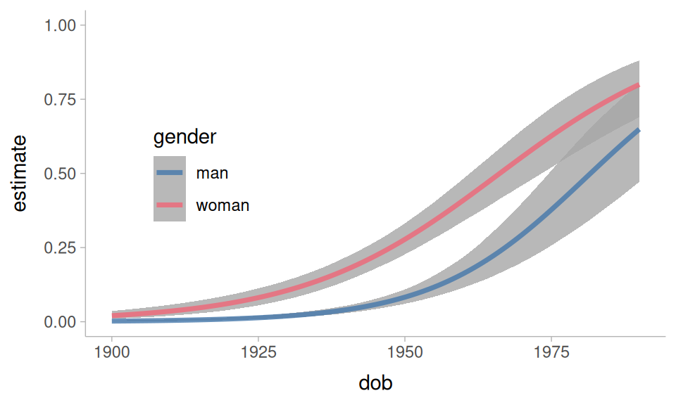
We can get the “expected” predictions from the model by setting up a representative prediction grid. We’ll start with a focus on the language change in progress.
dob_gender_grid <-  datagrid(
  model = um_model,
  gender = unique,
  dob = 1900:1990,
  total_rate = 5.3,
  relative_rate = 1,
  fol_class = "pause"
)
When we use this prediction grid, we’ll want to set re_formula = NA. This is a brms specific argument that sets the random effects to 0 when getting our predictions. We want to do this because the speaker variable is set to the value of the speaker with the most data. They’re not necessarily a representative speaker, so we don’t want to include the random intercepts and slopes when estimating the predictions.
um_model |>
 predictions(
   newdata = dob_gender_grid,
   re_formula = NA
 ) ->
 dob_gender_pred
Plotting code
dob_gender_pred |>
 ggplot(
   aes(dob, estimate, color = gender)
 ) +
 geom_lineribbon(
   aes(ymin = conf.low, ymax = conf.high),
   alpha = 0.8
 ) +
 ylim(0,1) +
 theme_sub_legend(
   position = "inside",
   position.inside = c(0.2, 0.5)
 )
One of the questions we had was whether the rate of change was the same for men and women. We can get estimated slopes over year of birth with the slopes() and avg_slopes() functions. This next table is telling us what the average effect of 1 year of dob is on the log-odds of “um”.
avg_slopes(
  um_model,
  variables = "dob",
  newdata = dob_gender_grid,
  type = "link",
  re_formula = NA
) |>
tt()| term | contrast | estimate | conf.low | conf.high |
|---|---|---|---|---|
| dob | dY/dX | 0.0678 | 0.0579 | 0.0778 |
We can also break this out by gender.
avg_slopes(
  um_model,
  variables = "dob",
  by = "gender",
  newdata = dob_gender_grid,
  type = "link",
  re_formula = NA
) ->
 dob_by_gender

dob_by_gender |>
tt()| term | contrast | gender | estimate | conf.low | conf.high |
|---|---|---|---|---|---|
| dob | dY/dX | man | 0.0763 | 0.061 | 0.0916 |
| dob | dY/dX | woman | 0.0593 | 0.0466 | 0.0718 |
The estimated slope for men is slightly steeper than for women. Another way to explore this is to look at how much the difference between men and women has changed over dob.
avg_slopes(
  um_model,
  variables = "gender",
  by = "dob",
  newdata = dob_gender_grid,
  type = "link",
  re_formula = NA
) ->
 gender_by_dob
Plotting code.
gender_by_dob |>
 ggplot(
   aes(dob, estimate)
 ) +
 geom_hline(
   yintercept = 0,
   linewidth = 0.5
 ) +
 geom_lineribbon(
   aes(ymin = conf.low, ymax = conf.high),
   alpha = 0.8
 )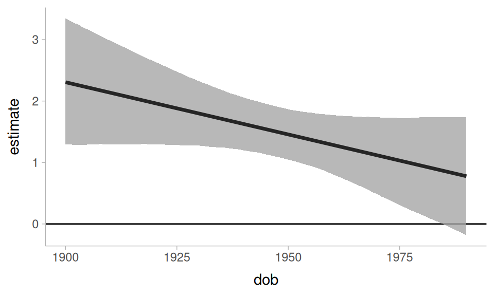
NoteAside
It’s not straightforward from looking at just the estimated slopes by gender in Table 13 to tell whether the slopes are reliably different. However, because we fit the model with brms, we can extract the posterior draws from the marginal effects object, and carry out some additional estimation.
| interaction | .lower | .upper | .width | .point | .interval |
|---|---|---|---|---|---|
| -0.017 | -0.0368 | 0.00329 | 0.95 | mean | hdci |
The interaction effect doesn’t seem that reliable.
Now, let’s turn to speech rate effects. At a first pass, we’ll get just the predicted log-odds of “um” over relative speech rate. For this, I’ll set up a relatively balanced prediction grid across all predictors. I’m making the spread of values across the numeric predictors a little less dense to speed up computation.
Now, I’ll get the average predicted “um” probability across relative_rate.
avg_predictions(
  um_model,
  newdata = rate_grid,
  by = c("relative_rate"),
  re_formula = NA
) ->
rate_pred
Plotting code
rate_pred |>
 ggplot(
   aes(relative_rate, estimate)
 ) +
 geom_lineribbon(
   aes(ymin = conf.low, ymax = conf.high)
 ) +
 scale_x_log10() +
 ylim(0,1)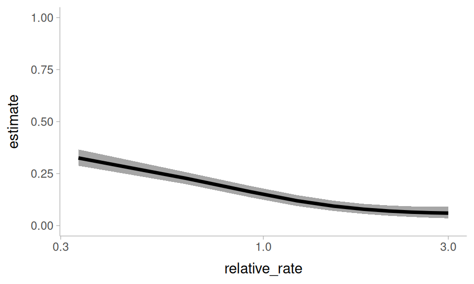
relative_rate, marginalizing over all other predictors
We can break down the these predictions by another hesitation indicator: the following segment
avg_predictions(
  um_model,
  newdata = rate_grid,
  by = c("relative_rate", "fol_class"),
  re_formula = NA
) ->
 rate_by_fol
Plotting code
rate_by_fol |>
 ggplot(
   aes(relative_rate, estimate, color = fol_class)
 ) +
 geom_lineribbon(
   aes(ymin = conf.low, ymax = conf.high),
   alpha = 0.6
 ) +
 geom_line(
   linewidth = 1.5
 ) +
 ylim(0, 1) +
 scale_x_log10() +
 theme_sub_legend(
   position = "inside",
   position.inside = c(0.85, 0.5)
 )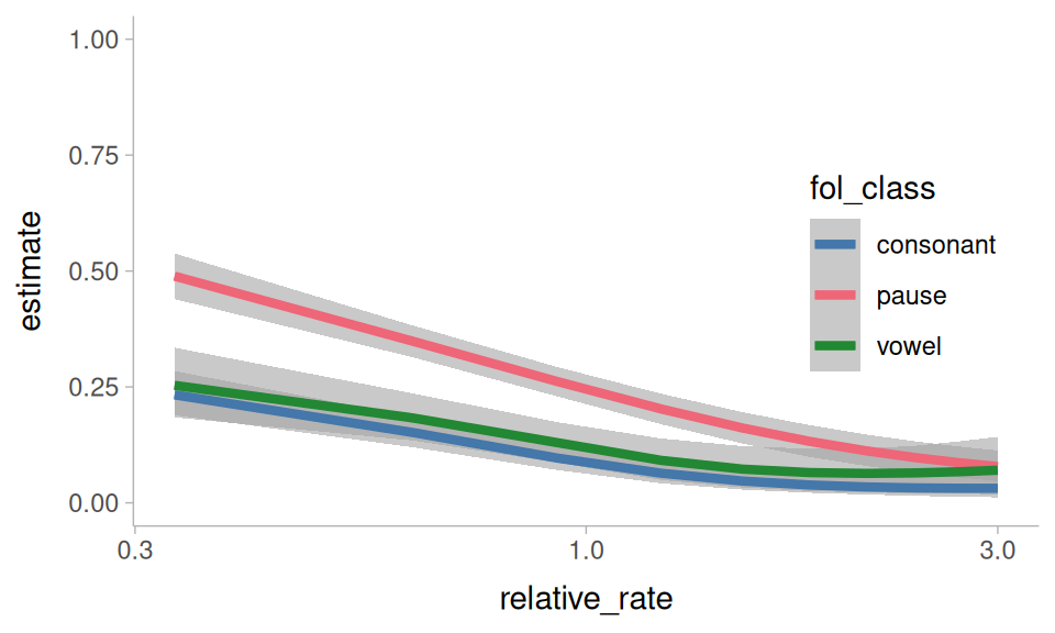
relative_rate, and fol_class, marginalizing over all other predictors
One of the questions I’d asked above is whether the effect of relative speech rate is affected by how baseline fast or slow a speaker is. We can explore that here with avg_slopes(). Because relative_rate is a ratio, I’ll set slope = "dyex". This means the estimated slopes will describe how the log-odds of “um” changes as relative_rate increases by 100% (instead of +1).
avg_slopes(
  um_model,
  newdata = rate_grid,
  variables = "relative_rate",
  by = "total_rate",
  slope = "dyex",
  type = "link",
  re_formula = NA
) ->
 rate_by_total_slope
Plotting code.
rate_by_total_slope |>
 ggplot(
   aes(total_rate, estimate)
 ) +
 geom_lineribbon(
   aes(
     ymin = conf.low,
     ymax = conf.high
   )
 ) +
 scale_x_log10() +
 labs(
   y = "relative rate slope"
 )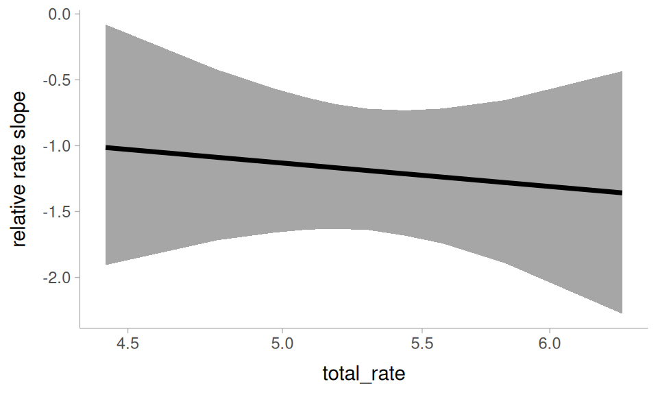
relative_rate by total_rate
It doesn’t seem like someone being an overall slower or faster talker interacts with the effect of relative speech rate.
Another thing to ask is whether the effect of relative speech rate has been affected by the language change! To look at this, we’ll get the average slope of relative_rate, grouped by date of birth and gender.
avg_slopes(
  um_model,
  newdata = rate_grid,
  variables = "relative_rate",
  by = c("dob", "gender"),
  slope = "dyex",
  type = "link",
  re_formula = NA
) ->
 rate_by_change_slope
Plotting code.
rate_by_change_slope |>
 ggplot(
   aes(dob, estimate, color = gender)
 ) +
 geom_hline(
   yintercept = 0
 ) +
 geom_lineribbon(
   aes(ymin = conf.low, ymax = conf.high),
   alpha = 0.6
 ) +
 geom_line(
   linewidth = 1.5
 ) +
 theme_sub_legend(
   position = "inside",
   position.inside = c(0.5, 0.9),
   direction = "horizontal"
 )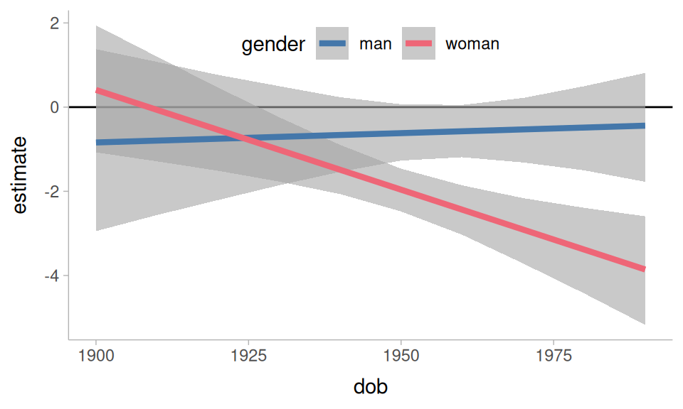
relative_rate by dob and gender
The result is a bit unexpected: It looks like the effect of relative speech rate has been growing stronger for women, and was never all that reliable for men.
More kinds of models
As I said above, while I used brms to fit the model for this tutorial, the functions covered here would work in just the same way for many other kinds of models.
flat_um_model |>
 predictions(
   newdata = datagrid(
     dob = 1900:1990,
     gender = unique,
     fol_class = "pause",
     relative_rate = 1
   )
 ) |>
 ggplot(
   aes(dob, estimate, color = gender)
 ) +
   geom_lineribbon(
     aes(ymin = conf.low, ymax = conf.high),
     alpha = 0.8
   )+
   ylim(0,1)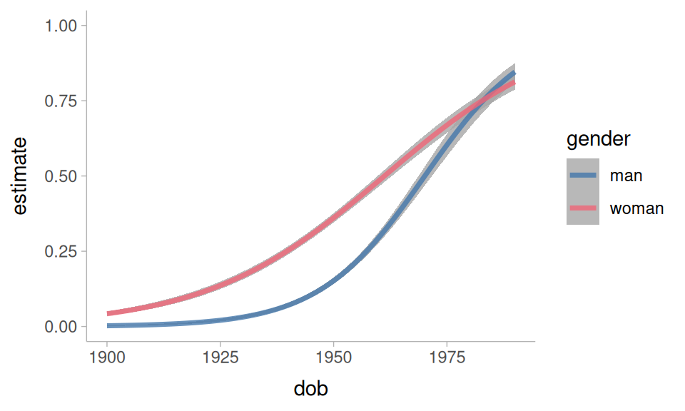
They also work well for non-linear smooths.
non_linear |>
 predictions(
   newdata = datagrid(
     dob = 1900:1990,
     gender = unique
   ),
   re_formula = NA
 ) |>
 ggplot(
   aes(dob, estimate, color = gender)
 ) +
   geom_lineribbon(
     aes(ymin = conf.low, ymax = conf.high),
     alpha = 0.8
   )+
   ylim(0,1)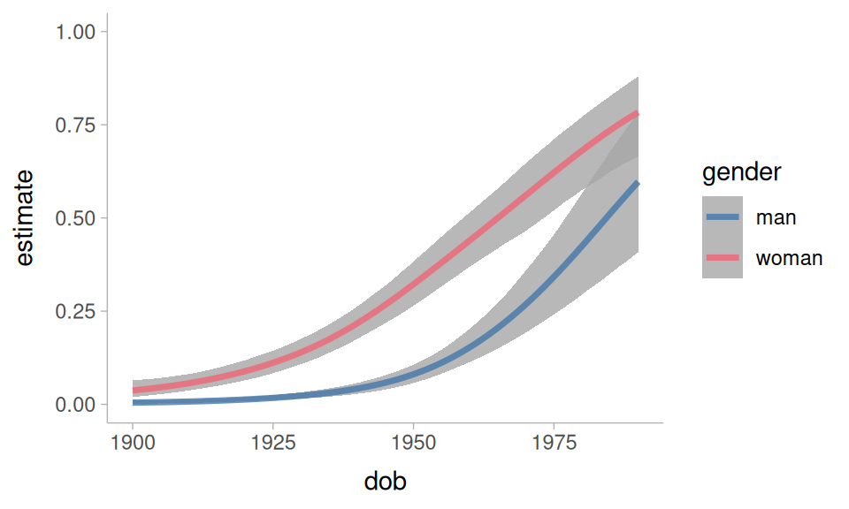
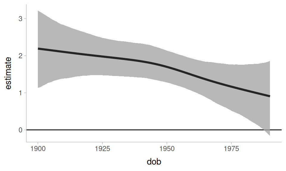
We can even get a difference curve
non_linear |>
 slopes(
   newdata = datagrid(
     dob = 1900:1990,
     gender = unique
   ),
   variables = "gender",
   by = "dob",
   type = "link",
   re_formula = NA
 ) |>
 ggplot(
   aes(dob, estimate)
 ) +
   geom_hline(yintercept = 0, linewidth = 0.5)+
   geom_lineribbon(
     aes(ymin = conf.low, ymax = conf.high),
     alpha = 0.8
   )
Further reading
I can’t cover everything worth knowing about the marginaleffects package in a single tutorial. For further reading I would recommend:
-
These blog posts by Andrew Heiss:
References
Arel-Bundock, Vincent. 2025. Model to meaning: How to interpret statistical models with marginaleffects for r and python. Retrieved from https://marginaleffects.com/
Arel-Bundock, Vincent. 2026. Model to meaning: how to interpret statistical models with R and Python. Boca Raton London New York: CRC Press, Taylor & Francis Group.
Arel-Bundock, Vincent & Greifer, Noah & Heiss, Andrew. 2024. How to interpret statistical models using marginaleffects for r and python. Journal of Statistical Software. 111. 1–32. Retrieved from https://doi.org/10.18637/jss.v111.i09
Clark, Herbert H. & Fox Tree, Jean E. 2002. Using uh and um in spontaneous speaking. Cognition. 84(1). 73–111. Retrieved from https://www.sciencedirect.com/science/article/pii/S0010027702000173
Fruehwald, Josef. 2016. Filled pause choice as a sociolinguistic variable. U. Penn Working Papers in Linguistics. 22(2). 41–49. Retrieved from https://repository.upenn.edu/pwpl/vol22/iss2/6/
Heiss, Andrew. 2022a, May 22. Marginalia: A guide to figuring out what the heck marginal effects, marginal slopes, average marginal effects, marginal effects at the mean, and all these other marginal things are. Retrieved from https://www.andrewheiss.com/blog/2022/05/20/marginalia/
Heiss, Andrew. 2022b, November 29. Marginal and conditional effects for GLMMs with marginaleffects. Retrieved from https://www.andrewheiss.com/blog/2022/11/29/conditional-marginal-marginaleffects/
Wieling, Martijn & Grieve, Jack & Bouma, Gosse & Fruehwald, Josef & Coleman, John & Liberman, M. 2016. Variation and change in the use of hesitation markers in germanic languages. Language Dynamics and Change. 6(2). 199–234.
Reuse
CC-BY-SA 4.0
Citation
BibTeX citation:
@online{fruehwald2026,
  author = {Fruehwald, Josef},
  title = {Using \{Marginaleffects\} to Understand Statistical Models},
  series = {Linguistics Methods Hub},
  date = {2026-05-06},
  url = {https://lingmethodshub.github.io/content/R/using-marginal-effects/},
  doi = {10.5281/zenodo.20055727},
  langid = {en}
}
For attribution, please cite this work as:
Fruehwald, Josef. 2026, May 6. Using {marginaleffects} to understand
statistical models. Linguistics Methods Hub. (https://lingmethodshub.github.io/content/R/using-marginal-effects/).
doi: 10.5281/zenodo.20055727